Exploring The Contrast Between Colour and Black and White Photography
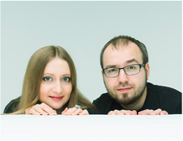
Alexander Khokhlov
|
Alexander Khokhlov and Veronica Ershova is a photographers duo world renowned for it’s creative projects. created in collaboration with famous Russian make-up artist Valeriya Kutsan. Mix of face art, photography and post-production allowed to create optical illusions. |
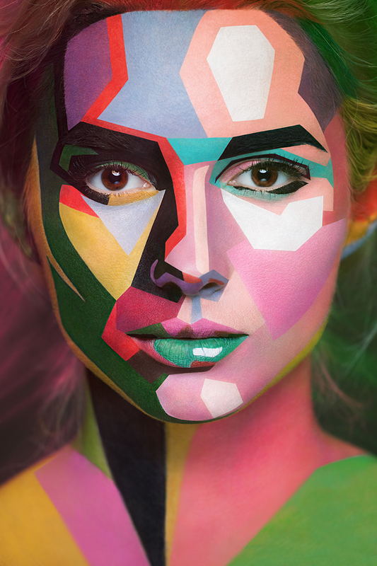
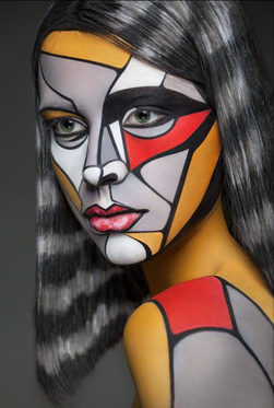
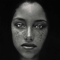
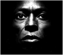
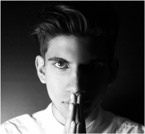
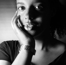
These are 4 of my favourite images from Alexander Khokhlov's 3D/popart collection. My favourite 2 are the 1st and 3rd images. I like these two photographs because they personally stand out to me and drew me in. The use of the frame and creativity through face paint are what particularly caught my eye.
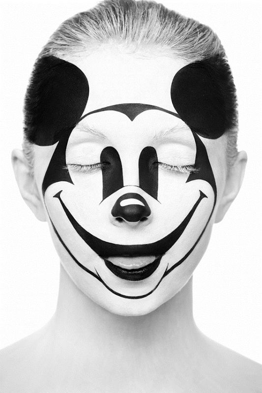
This is one of my favourite images from the 3D collection created by Alexander Khokhlov. I personally like this one lot due to the creativity from the makeup artist. The idea of using a cartoon character gives the photo a playful mood/atmosphere. Secondly i like the way the artist and photographer painted over the models hair as well, this allowed the image painted on the face to be the only focus.
|
|
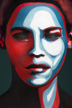
I like this photograph mainly because of the cartoon effect it gives off. The photographer has captured the models hair as the background and this gives the image a further illusion of it being cartoon or not real. Not only this but the way the image has been composed helps this atmosphere be conveyed. I like how the face paint has been painted in sharp shapes the allows the pop art to appear more abstract.
|
|
Recreation
|
|
Here are my recreations of Khokhlov's work, i decided to mainly explore the use of her 3D/pop art material. For these i simply used acrylic paint on the face. Once i captured enough images i took them to photoshop and edited them to make certain features of the images like Alexander Khokhlv's. |
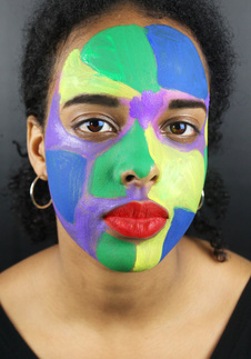
This first recreation has been composed like the third image of the photographers displayed above, it is also my favourite recreaion. I have framed the models face to be directly in the middle, as well as this i have asked the model to give no expression just like Alexander's work. Not only this but in photoshop i used the burn tool on her eyebrows because 'the photographers models have been given very prominent brows. I like the fact that the background is grey, it allows the colours on the face to stand out.
|
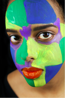
For this photo i used the burn tool to make the background black, because most of Alexander Khokhlovs's images are filling the whole frame, so i covered this. I also used the sponge tool on photoshop to bring out the colours in the image. Furthermore i created another layer for her lips and painted her lips to be orange, i did this as in Alexader Khokhlovs's work the lips are always painted in.
|
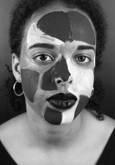
This image is the same as the first recreation. As you can see i chose to make this one black and white. i did this because i wanted to experiment with the way colours will be displayed trough grey scale. I played around with the desaturation and came out with this as my final outcome. Clearly the contrast between dark and light colours shown through the shades of black and white. i personally do like the way this turned out,i think that its something unusual but good.
|
Irving Penn
|
Irving Penn was an American photographer known for his fashion photography, portraits, and still lifes. Penn's career included work at Vogue magazine, and independent advertising work for clients including Issey Miyake and Clinique. |
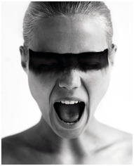
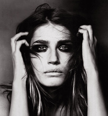
These are my four favourite images from Irving Penn's collection. I like these images specifically because of the contrast and depth shown in them. There is a clear contrast with blacks and whites, allowing a sense of atmosphere to be portrayed.
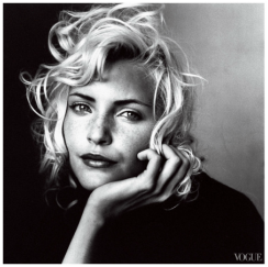
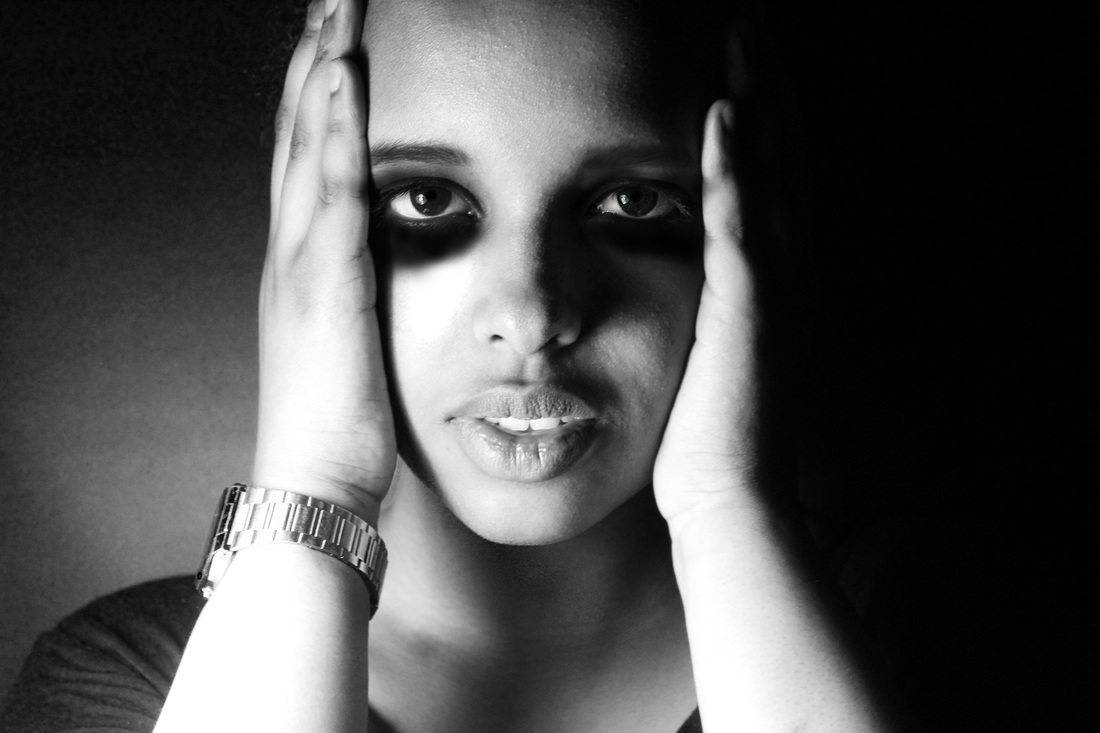
This is my favourite photograph of the four. I particularly liked this one because of the use of makeup and the lighting. The lighting in my opinion highlights her beauty but also allows a lighthearted mood to be given off. Secondly i like how the left side of the photo is completely black whereas the right side is much lighter. This contrast is something i want to use as inspiration in my work. The model in general has been clearly outlined and made the main focus.
|
|
This is my second favourite image of the four. I like this one because it is very different to the first photograph i like. This photo has a completely opposite atmosphere, it's almost fearful. The use of vignette and burning of the image has allowed this atmosphere to be created. It also lets the viewer focus soul on the details on the models face and expressions.
|
|
Recreation
Here are my recreations of the images from above, some of these are direct recreations and the other is inspired by Irving Penn's work.
This first photo is one of my most favourable ones. This is because of the way i have composed this image, the model is centred like most of Irving Penn's work, but also i have used split lighting. Although the photogrpher doesn't use split lighting her work inspired me to try this and then edit it in her style through photoshop. I have highlighted the models eyes and face shape, i believe that this is what Irving Penn did the most throughout her images. As well as creating a clear contrast of light and dark in this photograph.
|
This photograph is a direct replication of the last image from above by Ivring Penn. I feel that in this picture i have been able to capture and edit the lighting similar to the photographers original work. Furthermore i know that the quality of the image can be improved and this appears to be slightly blurred, this was ,most likely due to not using a tripod. However i also used photoshop to crete the dark makeup underneath her eyes on the eyelids. Also i filled in the models eyebrows to show the sharpness which the photographer displays through her work.
|
This is my second favourite image which i recreated. I really like the way i have captured the detail in her face, this was also enhanced using photoshop. Once again i have created contrast in the image from one side of the picture to the other. This was also done by the lighting which i chose. Furthermore i appreciate the way her whole head is not in the image, i decided to crop out the bottom and top of the photograph as this is therefore more of a replication of Irving Penn's work.
|
