ART
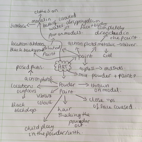
For this page my aim is to work with powder paint as well as paint. My main aim for this page is to photograph vibrant coloured paints and powders. Throughout this page i will be exploring how to successfully capture powder paint being thrown, and to capture paint being poured/dripped down faces or bodies.
Mood-Board
|
|
|
Ideas
|
|
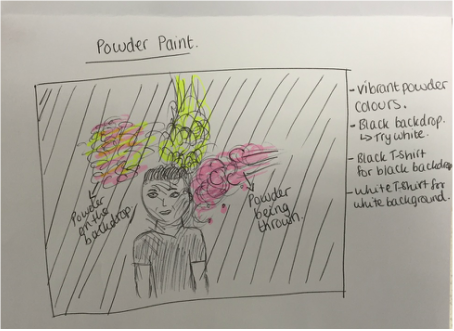
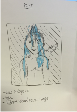
My initial ideas here were to capture powder being thrown and hitting the model, as well as capturing their reactions. I would use various colours which look good together for that. My second image shows my idea for paint, i will pour paint on the model from the top of them and try the photograph the textures of this.
Brainstorm
ARS THANEA
|
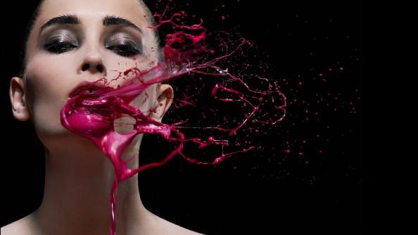
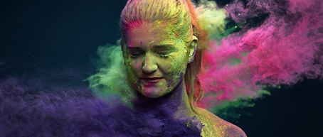
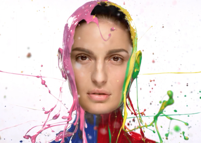
Created by the designers at Ars Thanea, this majestic photoshoot is include a multicoloured powder portraits. Having found the “holi colours” straight from India, the photoshoot soon became soaking in colour, deep saturation, and a lot of magical dust. |
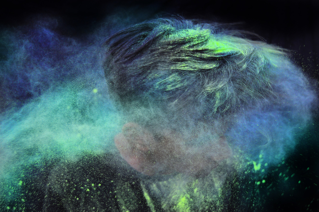
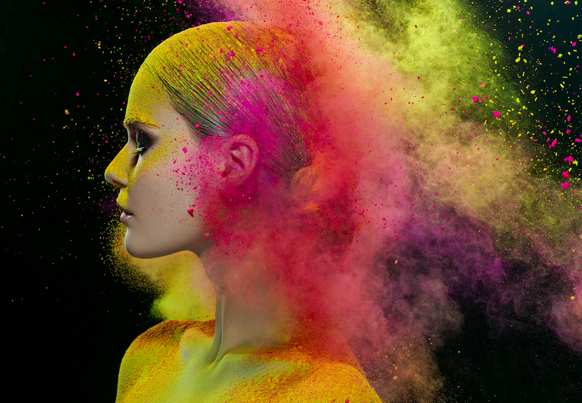
From the collection created by Ars Thanea this is one of my favourite images. This is because of the way she has captured the texture of the powder in the hair, and the powder around her head. Furthermore i really like the use of movement used in this, although all the photos created by Thanea in this collection are using motion through the powder being thrown, i feel this particular image has expressed and captured the movement of her head well, as well as portraying a joyful atmosphere.
|
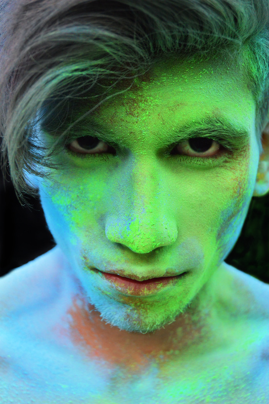
This is another favourite of mine from the majestic collection. I really like this photograph because of the facial expression shown, also the powder on his face has been captured in fine detail. Furthermore i like the fact the lighting in this image as well as the rest have not been vibrant or too dull. I think that the right amount of light has been used in order to allow the colour and texture of the powder stand out in this majestic shoot.
|
Both of these images are at two different stages in their shoot, I like that the photographer has chosen to take the photographs at various times and not all at the same time. I feel this is more captivating as the first image is a moment which in reality the human eye cannot capture as clear and in detail as Ian has here. Furthermore the second image is just as captivating as the first, this time because of the the models hong no facial expression, i think this brings more emphasis to the powder being thrown around him.
Recreations

IAN CRAWFORD
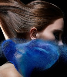
|
Ian grew up in Africa and developed a passion for photography at an early age. Iain loves to capture images that have a strong graphic and textural quality, often searching out the graphical symmetry in chaos, while still maintaining the personality and emotion of the subject. |
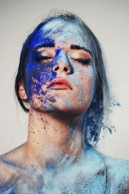
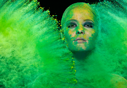
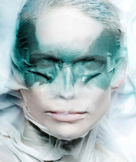
This is one of the many photographs from the Ian Crawford beauty collection. This is my favourite image due to the tones of colours being used. I like the cold tones of blues within the powder and the makeup on the model. Furthermore the use of these colours and makeup portray the theme of winter and the powder acts as snow. I particularly like that all images have been taken on a black background, i think this gives more effect to the colour and texture the image consists of.
|
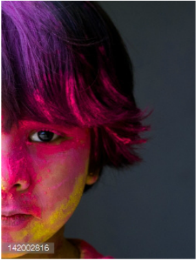
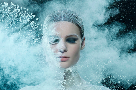
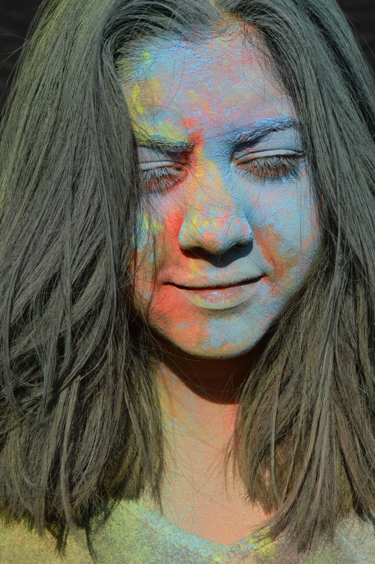
This is my second most favourable image from the photoshoot. I like this one a lot because it's in contrast to the first one, the use of vibrant colours in this create a different atmosphere to the rest. It allows a carnival atmosphere to be produced, and a mood of intensity and fun. Furthermore the composition of the image is to my favour as the photographer as used the rule of thirds, and as there is powder already on her face it gives of the effect that she is almost drowning or suffocated in it.
|
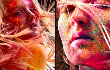
These two images are different to my favourites but i still like them and will use them for inspiration for my work. The first one consists of multi coloured powders and so does the second one. However both have been captured differently. The first image is a side view of the model and most of the frame has not been filled with powder. The second images are close ups, this may be easier for me to recreate, so this is ti my benefit, furthermore there's an effect of the powder being splatted onto her face with is different from the other images this photographer has created.
|
|
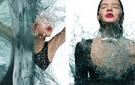
These two images aren't what i originally planned to create, however whilst looking through Ian's work these images have drawn to my attention. I feel like this is something different and much more creative when it comes to working with paint. i am going to attempt to recreate this second image because i think that i could recreate this successfully. I also really like the image below with water, i think this is something different and very engaging, i can also colour the water and make the water appear very vibrant and detailed.
|
|
Recreations
|
|
|
|
EMMANUEL ROBERT
|
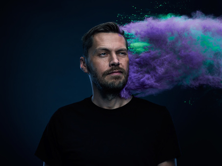
Emmanuel is a student in the UK who decided to do a Powder Paint Shoot. His main interest in this was purely for the exploration of colour. The shoot was done in 2013. |
|
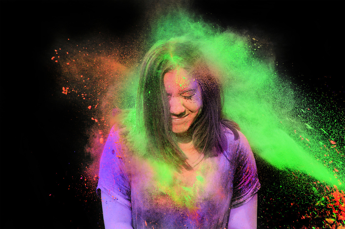
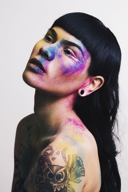
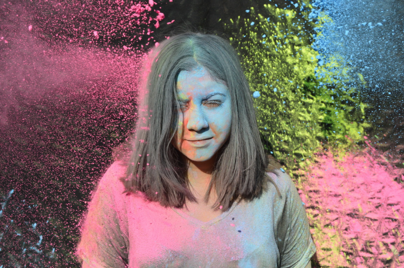
This is my favourite image taken by Emmanuel in his powder paint shoot. This is because of the two different powder colours being used, they appear to be split down the body and face. Not only this but the colours are bright and vibrant, i feel this really draws me in as a viewer to the image - creating a light and playful mood. The composition of the image is something i would use as inspiration for my pictures as the model is the main focus and takes up most of the frame. This therefore leaves no other distractions in the image.
|
|
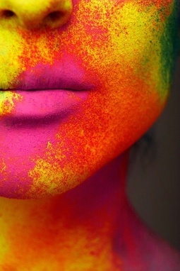
This is my second favourite photograph from this collection. I appreciate this image because the photographer has taken a close up of model, this is different to other images I've seen using this theme, it allows the modes face to only be the focus. Furthermore this image hasn't been taken whilst powder was being thrown, its a still image capturing the details of the colour and texture the photo consists of. I will be using this as a guidance for when i take recreation shoot as well as for my final pieces.
|
|
|
These two photo's have been taken whilst in the process of the powder being thrown onto the models. I am going to use these as inspirations for my final pieces. I like the collision of the 2 colours in the second one and the height it is being thrown at. Furthermore they have framed the model different in these 2 photos compared to other images i spoke about above, i am going to aim to recreate these.
Recreations
|
|
|
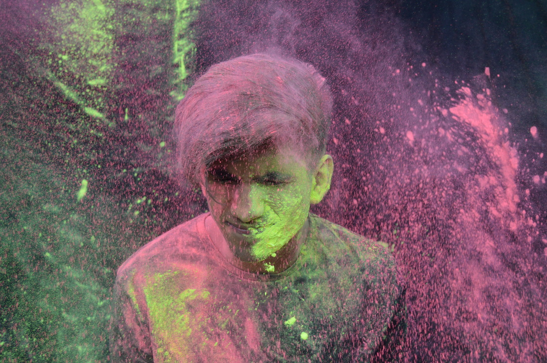
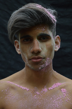
Photoshoot 1
This is my first photoshoot for using powder paint. This shoot was done outdoors using natural lighting. The main aim for this photoshoot was to to be able to create the clear effect of powder pint being thrown at the model, furthermore i was looking to capture the vibrancy within the powders. For these shoot i will have my camera setting on sports mode so that i can capture the powder hitting the face and being thrown.
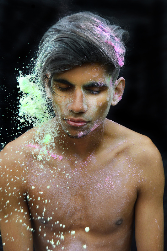
This is one of my favourite images from the photoshoot. I like this because of the way i have composed the model in the frame. i have taken the photograph from a high angel, i have also made the models hair messy to add to this effect of chaos. Furthermore i told the model to look straight into the lens to create an intense atmosphere. I also asked the model to wear black with the black background, this way any colour that is in the image stands out further. From this shoot i came to a conclusion that the black background works better for this style of shoot.
|
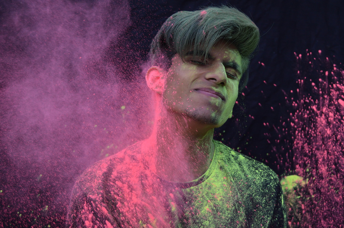
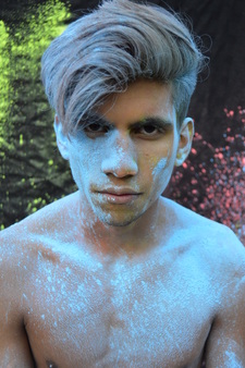
this is my favorite image from the whole photoshoot, this is because of the positioning of the model and the composition. I have taken a low angle photograph, this enables the lighting to compliment the structure of the models face, furthermore the lighting has hit the right places so that features have been extenuated - natural lighting outside. The black background once again brings out the colour in the image and also lets the model be the main focus. I also like the way i have filled most of the frame with the model, however i am aware that there is not enough powder pain in this and it also needs to be much more vibrant in colour - this will be redone.
|
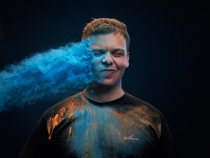
Photoshoot 2
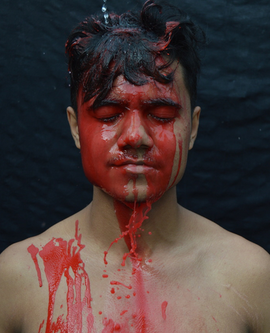
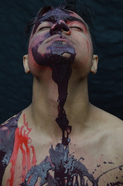
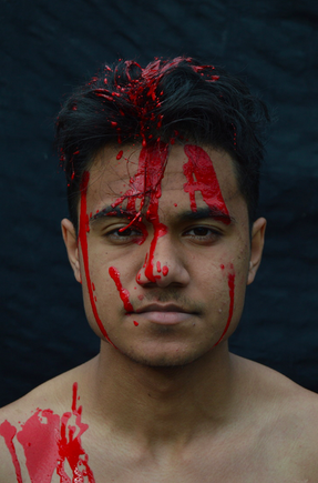
This photoshoot is my first attempt at using paint. This shoot was captured outdoors using natural lighting. I decided to use only a black backdrop because i think that would enhance the paint colours being used. The aim for this shoot was to be able to capture the texture of the paint drip on the face and body.
|
|
|
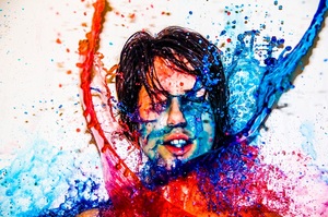
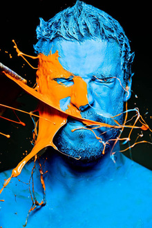
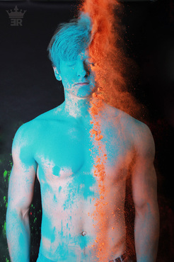
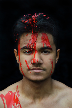
This is my favourite photograph from this photoshoot. I like this one due to the structure of the image, i told the model to tip his head back, this way we are able to see the paint down his neck and body - i like the effect this has created. The lighting for this image was, in my personal opinion, really convenient - i am using natural lighting outdoors. Once again for this shoot i stuck to the black background, i really believe that it appears visually better and compliments the colours used in the photoshoot. I will be editing this image as a potential final piece.
|
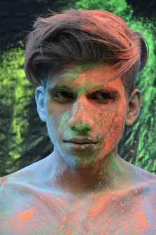
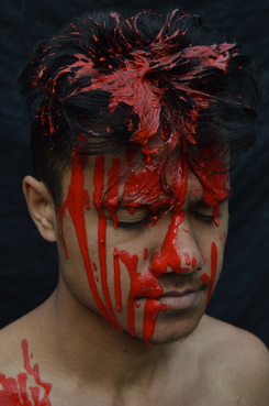
This photograph is my second favourite image, this is because of the way the paint is dripping down his face. Furthermore the paint isn't applied neatly and therefore gives a messy effect to the photo. i like the use of the red paint with the black background, it insinuates the theme of danger, also the theme of hurt as his eyes are closed whilst the paint drips on his face is depicted through this. I used narrow depth of field on this face to capture the detail of the paint because i thought this was important.
|
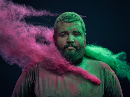
Photoshoot 3
This was my improved photoshoot from the first shoot i did with powder paint. In this i was able to use real powder paint, therefore the colours were much more bright. I think this attempt was very successful and i will be editing some of these and hopefully making my final pieces from here.
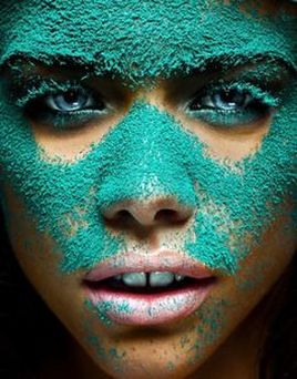
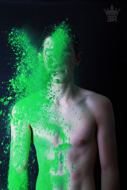
this is my favourite photo from the shoot. I like this one a lot for multiple reasons. Firstly i really like the way i have directed the powder paints to come in from two directions of the model, this allowed the image to look full of colour and no part of the frame has been left colourless. Also i like the fact that i used the luminous yellow powder first and left it on the model, this not only created a variety of colour but the contrast between the two lets them both really stand out and catch your attention. More so the composition of this image is in my opinion perfect, the model fills most of the frame, and the paint fills the rest. I think this image was the most successful at portraying what i want. I will be editing this image as a potential final piece.
|
This is my second favourite photograph from the shoot. I like this one due to the framing of the model and the backdrop. The way the colours are still on the backdrop really supports my theme of colour, i like this because there's more than one different colour in the image, and the model is only in blue. Therefore the model isn't the only focus in the image but that's expected as the range and brightness of the colour should be. The way i have composed this works well as the model is centered and once again the colours behind him are also prominent. I do feel as if the lighting and the blue powder haven't work as well as could of, it seems to be a bit overexposed on the models shoulders, however i will fix this in photoshop.
|
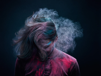
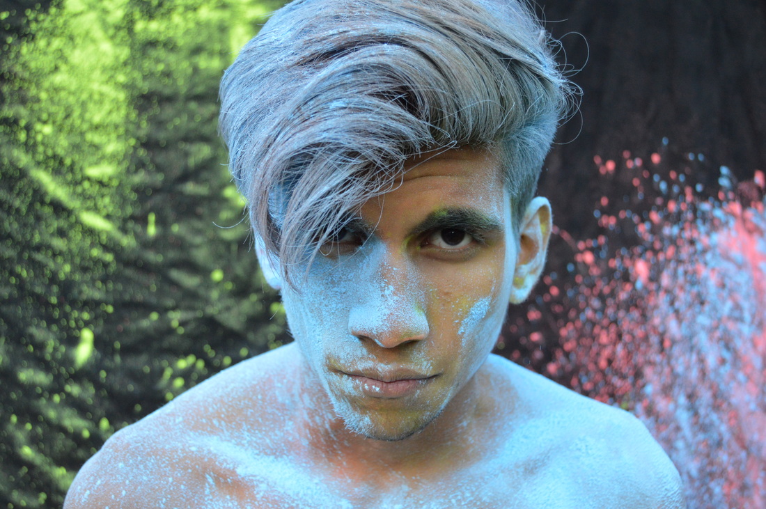
Photoshoot 4
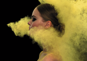
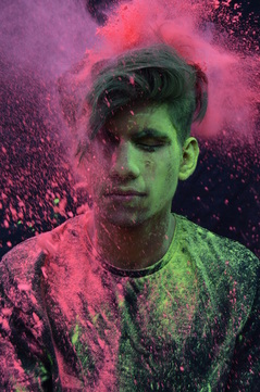
This photoshoot is using powder paint, my aim for this shoot was to capture the smoke come off her hair when she shook it as well as the powder being thrown at the model. I also wanted to get some good reaction shots from this, i asked the model to be natural at times so i could achieve this.
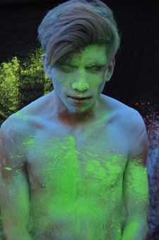
This is one of my favourite images from the shoot. This photoshoot was taken outside using natural lighting. I like this picture because of the various use of colours within it. Furthermore you can see the movement of the powder being thrown and hitting the model, this was something i wanted to capture and successfully achieved. However i do think that the vast amount of colours in the picture might be a bit overwhelming, and would look better with just 2 main colours in the shot.
|
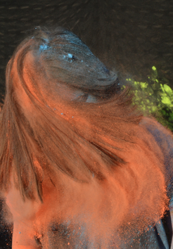
This is my second favourite photograph, As you can see in this image i have tried to capture the motion of the hair and powder which is in it. I think i have done this well and that the motion of the powder paint shown look really good. I have used a black backdrop in these photos because it will allow the colour of the powder to stand out more and appear more vibrant. Additionally i like the way i have composed this image, i have focused on the powder and the hair of the model in this photo and attempted to have it bottom and middle heavy with space remaining at the top.
|
experimental shoot
|
|
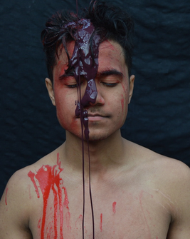
This is an extra part of the photoshoot from above. Here i decided to mix powder paint and paint, this was just an experimentation of the two materials to see how they would work together. From this i have concluded that they didn't work so well together and should just be separate to give the full effect that i want in my images. |
Experimentation
Before After
|
|
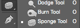
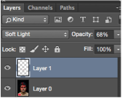
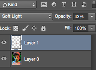
This is an experimentation from my first paint photoshoot. For this image i firstly adjusted the brightness and contrast, secondly i used the healing tool to remove and blemishes/marks to make the image look more clean. I used the burn tool to make the backdrop a darker pitch of black, i did this as i wanted to know how it would look in contrast with the paint and skin tone. I think it had a good effect on the overall image - allowed the paint and model to be the first focus of the image. Furthermore with the burn tool i made the upper body structure sharper and created a tad more depth. Using the sponge tool to make the paint much more vibrant as my theme is colour and texture, i then used the sharpening tool to enhance the details on his hair and paint. Lastly i added another layer and painted over the model's lips with a lighter/natural colour and applied the layer soft light and turned the opacity down to 68%. This is to give the image a finished/airbrushed look.
|

|
|
|
|
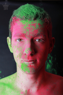
This is an experimentation from my first powder paint shoot. I personally think this edit was quite successful. Firstly i changed the brightness and contrast, then i took the burn tool and made the backdrop slightly darker but not pitch black. I also used the burn tool o create definition in the models ace and the upper body structure. i added four extra layers to this image, one was for overlaying the teen powder part, the second is for overlaying the pink powder paint, the third was for was for overlaying the models lip colour to make it look more natural and prominent. The last layer was for his skin, i overlaid the same colour in paint to make the image seem more finished and airbrushed. I adjusted all these layers with an overlay of soft light and toned down the opacity to the appropriate amount.
|
|
|
|
|
|
Here is another photo i have edited from this photoshoot. Firstly i adjusted the brightness and contrast, along with this i used the burn tool to contour his face and upper body structure. I also used the burn too on the roots of his hair to create more impact on the colours. As for the background i used the burn tool on the setting shadow so that the powder paint stands out as well as the background being black. I used the dodge tool after to lighten certain parts of the models hair and this was also done to the eyes to give off a mysterious look. I then used the sponge on the highest flow to enhance all the colours of the powder paint on the model. Lastly i added a new layer and painted over his lips to create a more natural/lighter colour, i overlaid this with soft light and turned the opacity down.
|
|

|
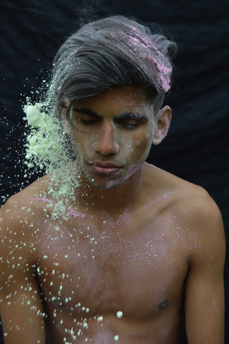
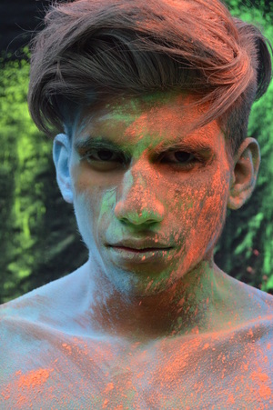
This is a photograph which i have edited and will be using as one of my final pieces. I am really pleased with the way this photograph turned out. The first thing i did to this image was adjust the brightness/contrast levels. Secondly i used the spot healing tool to remove unwanted blemishes, as well as this i used the burn tool to contour on the model's face and highlighting parts with the dodge tool, to create a prominent face and neck structure. After this i added another layer, with this i used a patterned paint brush with the colour purple in the top left corner of the image and then turned the opacity down to 20%, this was to make it look like there was more powder paint as well as incorporating the colour purple into the image simple because it looks nice alongside the other colours. Furthermore i created a second layer and with this i used a normal paint brush and with the lightest part of his skin colour i painted over the forehead of the model - to allow an airbrush effect and make the image more clean.
|
|
For this photo the first thing i did was adjust the brightness and contrast. Secondly i used the burn tool on 'shadow' for the background, using this will let the powder in this image to look bright and vibrant whilst the backdrop is black. I also used the burn tool in 'midtones' on the hair, i did this so the hair didn't look so ashy. Furthermore i used the sponge tool on all the colours of the image to increase the saturation of the powder. Also using the sharpen tool on the whole of the image, focusing on the model and the powder around her, this was to enhance the atmosphere of the power being thrown and hitting the model. Lastly i added a layer and painted over her lips with a natural/pink colour and overlaid it with soft light, for a more pigmented and natural look.
|
|
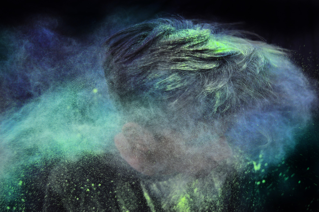
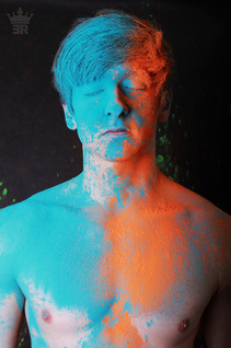
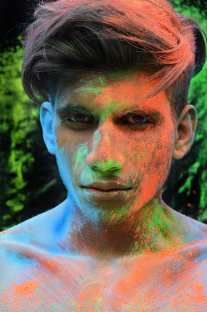
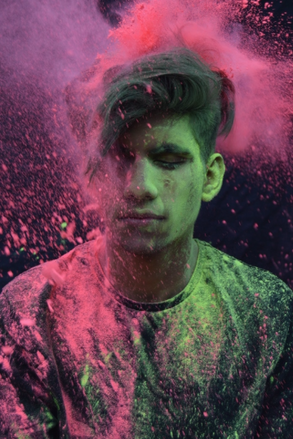
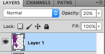
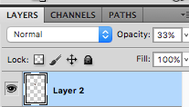
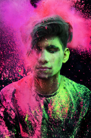
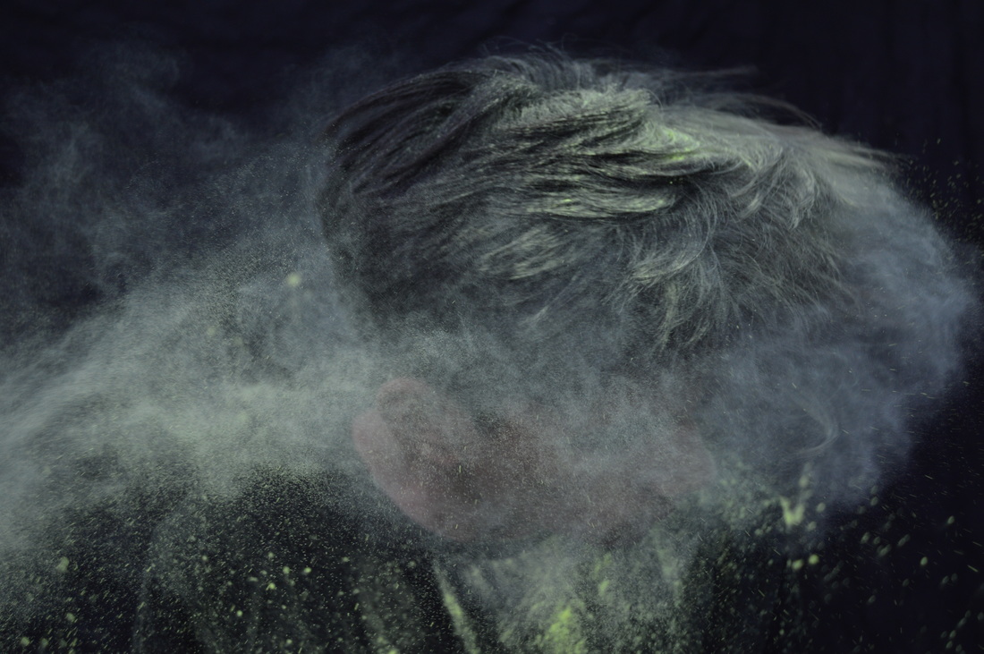
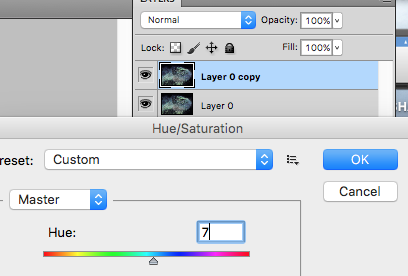
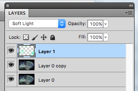
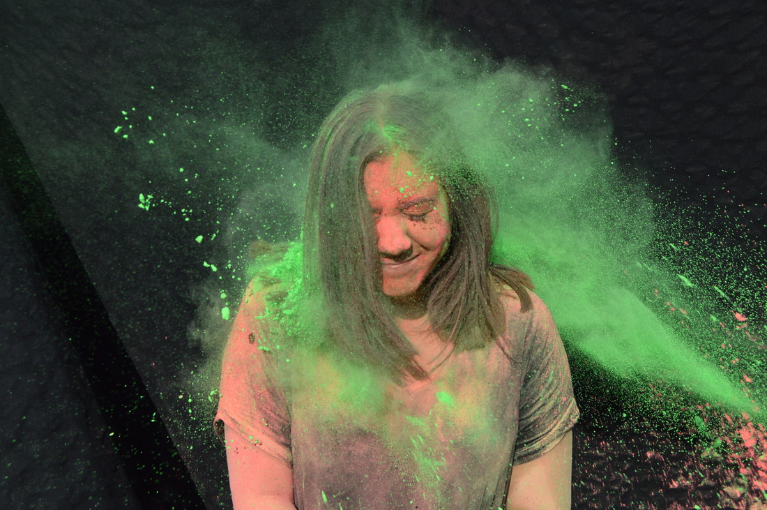
For this photo i used the burn tool on 'shadows' to make the background black, i also used it in his hair to bring out the colours of the powder. Furthermore i duplicated the original layer and then changed the hue/saturation to +7. This created a green and blue look. I then added another layer and painted over some of the powder with turquoise in the overlay soft light. Lastly used the sponge tool on these colours to intensify them, i also used the sharpen tool all over the image mainly on the smoke/powder effect around the model's head. I really like the way this image came out and i think it portrays a majestic mood.
|
|

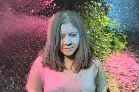
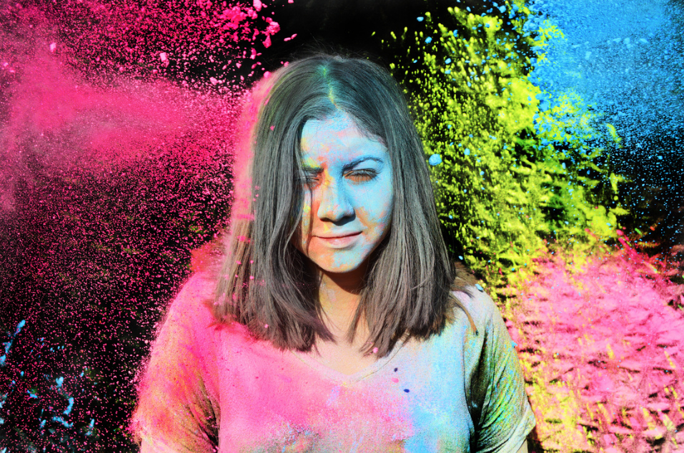
Firstly i adjusted the brightness/contrast of the image. I then changed the hue/saturation of the photo, i did this until i liked the outcome of colours shown, once i had done this i used the eraser tool and removed any colours i didn't want in the photo, therefore the original colours of the powder would appear. I left her t-shirt and arms purple, i left it like this because i thought it was visually appealing and the overall photograph looks much better than the raw image.
|

|
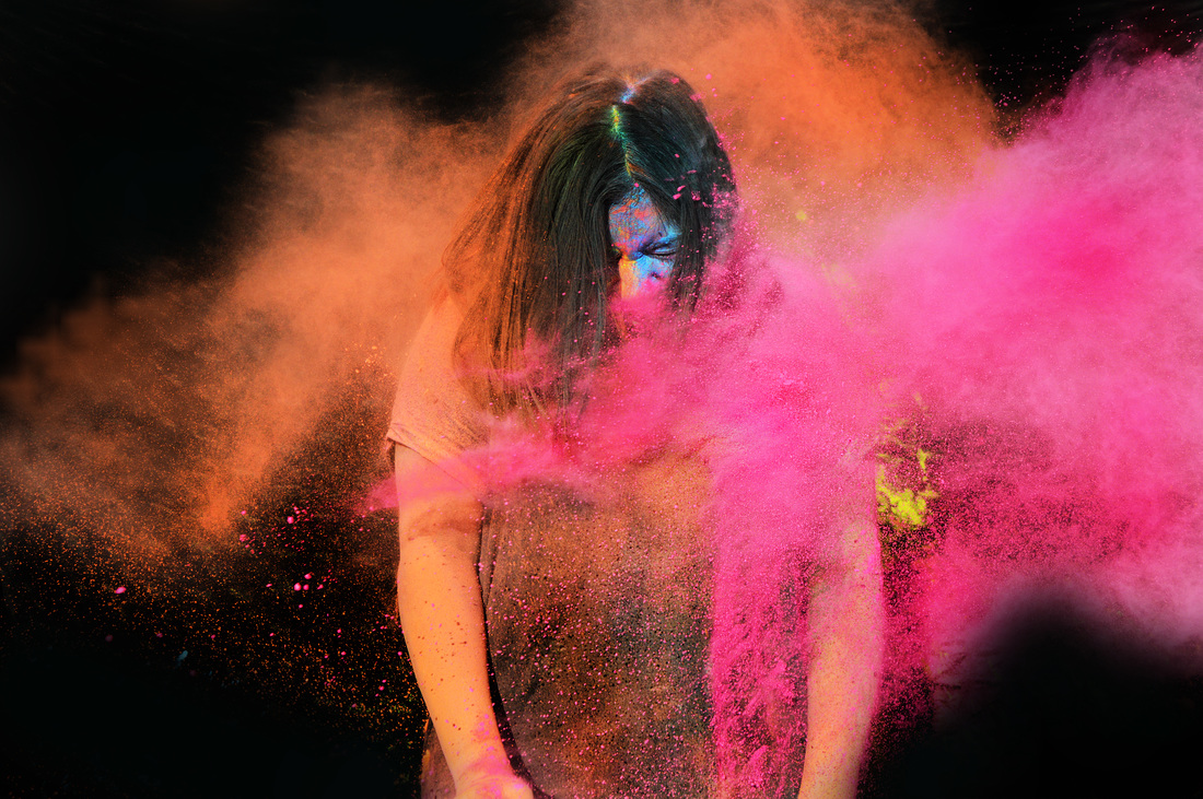
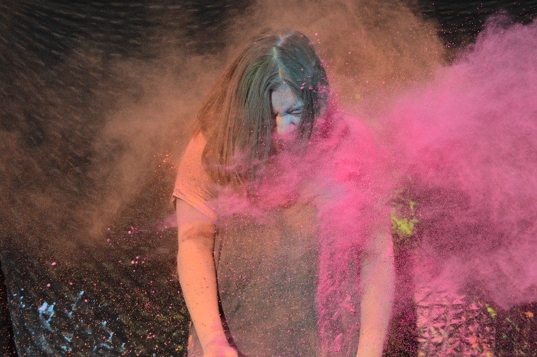
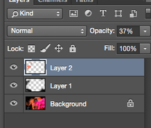
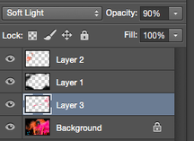
Firstly i used the burn tool in 'shadow' and used this on the backdrop as well as on the models hair. I then created a new layer because i wanted the background to be pitch black, so i used the paintbrush and painted the background black also therefore erasing some parts of the powder i didn't want to be seen. I also added a second layer and used a different paintbrush to add to the orange powder as i felt the opacity of it lacked in the original image, however i turned this opacity down to 37% so it looked more natural. I finally created a third layer which i took a normal brush and painted over some areas in pink to create depth and shadow i overlaid this with soft light on 90% capacity. Lastly i used the sharpen and sponge tool on the entire photo.
|
Final Pieces