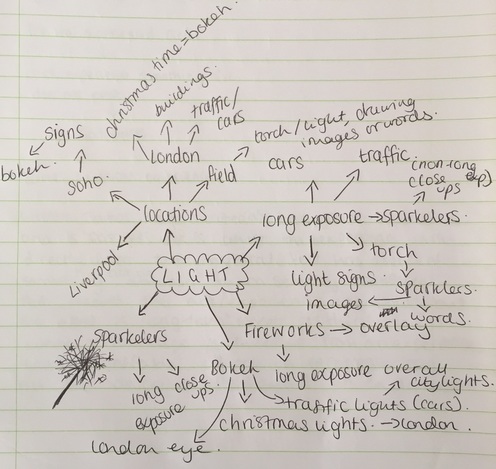
LIGHT
For this light unit i will be aiming to achieve images consisting of vivid lights in the evening. I will be exploring through signs, long exposure, bokeh and fireworks. My aim for these photographs will be to have either a good scenery with bright lights in any form, or to capture a light based photograph but with a meaning in it, e.g. a sign/words in long exposure light.
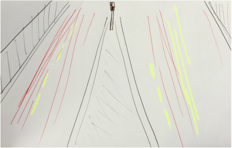
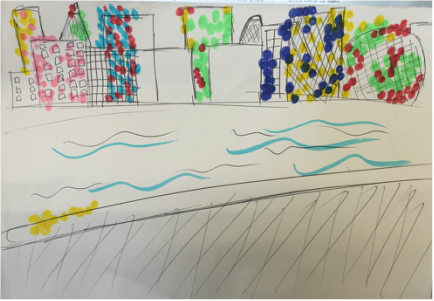
Mood-Board
|
|
|
|
|
|
Ideas
|
|
My ideas for this unit is to begin work with long exposure and lights, firstly i will be aiming to use long exposure with traffic so i can capture the cars going back and forth as well as the colour of the lights intensifying. Furthermore my second drawing here depicts bokeh light, i will attempt to capture cityscape in bokeh lighting and also locations with rivers and evening lighting so that my ideas will be successful in photograph form - i will try to overlay images and see how they turn out on photoshop.
Brainstorm
Locations


Here are some of the main locations i have chosen to go to for this unit of work - Soho, Tower Bridge, Regent's street, Southbank. I know that these areas will have a lot of lights for bokeh especially at this time of year (Christmas). It will also have lot of traffic for long exposure. I hope to capture good pictures at these locations, i think these are suitable places to shoot as they are constantly busy so it will had to the atmosphere of 'rush' in the images.
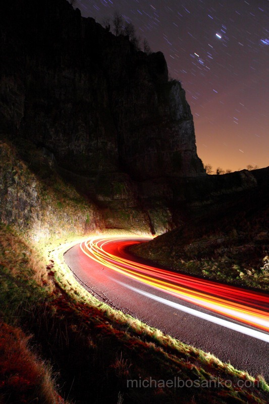
Michael Bosanko
|
With over ten years experience, Michaels photography covers modern and industrial architecture, advanced Light Graffiti, urban sub-cultures, bands, advertising, events and travel. |
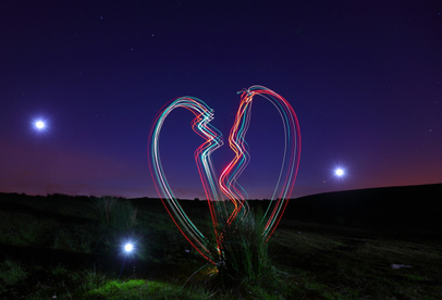
This is one of the images from the light paintings collection which I really like. This is due to the location the photographer has used. He has taken this in a field with empty space, also the time which the image was taken really works in positive ways on this photo - the sky is multiple colours, this works really well with the colours Michael has chosen for the broken heart, using red and blue stand out to the viewer as they are prime colours. I like how the subject is centered but not filling the frame, in a way this allows the subject to take more attention to itself, also the subject is the only main colourful thing in this photograph, emphasising colour - something I will like to achieve when recreating and in my photoshoots.
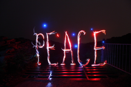
i chose this photo as one of my favourites because it's different to what I have already picked. Here the photographer uses various words in some of his light paintings. I particularly like this one because of the lighting and the colours he has used in it. The photographer has made the background almost pitch black, and leaving the words and reflection of the light to stand out in colour. The way he has allowed the reflection to be apart of the photograph applied to my theme of texture, I will be attempting this in my further work on light. Furthermore he has used blue and red again, two prime colours which I think grab a viewer's attention instantly. Lastly I feel that the word he has used, has created a lighthearted mood and mellow atmosphere.
|
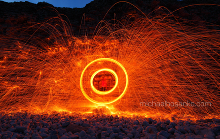
This is one of my favourite images from Michael's work, when i saw this image i instantly thought of catherine wheel's. I like this photo due to the mood and atmosphere it creates, the thought of fireworks makes me think of celebrations and festivals. Although the atmosphere is set high in spirits the colours and sharpness create a tense mood - the colour is very vivid and bold. I like this and will aim to create this feel and image when i attempt to recreate this as well as in my final pieces.
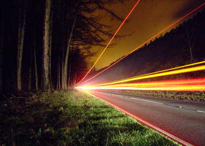
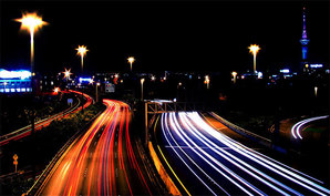
In this image Michael has used long exposure to create this light effect. I really like this photograph because of the way the photographer has framed the subject. He hasn't allowed the light to fill the frame but yet still take center stage. Once again the colours in this image have been most likely photoshopped to look so sharp and bright. This image is a prime example of what I would like to create - will be used for inspiration. Furthermore, this has been taken in the evening, this is the best time for long exposure on light to be captured - allowing the best quality to appear. I also appreciate the angel Michael had taken the photo in, he's taken it from a low angle, letting the beams of light the main focus and look powerful.
|
Recreations


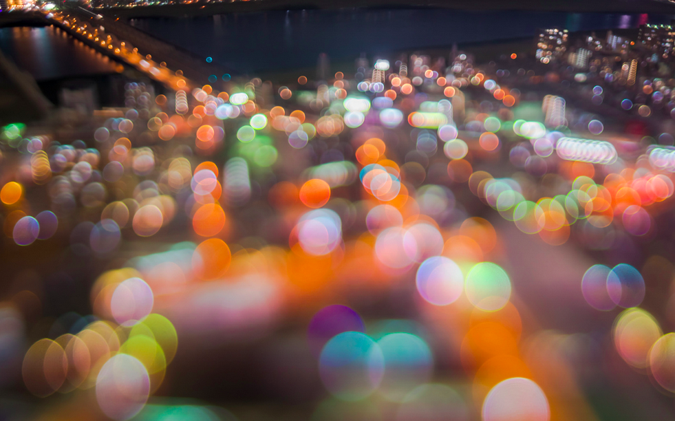
Takashi Kitamija
|
Takashi Kitamija is a photographer and a computer software engineer. By his continuous efforts he established his own method, emphasizing glows at night scenes. In 2013 he started a project 'extra bokeh' |
This is my favourite image from bokeh collection. I like this photograph a lot because the photographer has filled the frame with bokeh and there isn't much empty space left in the image. However some of Kitamija's images are bottom heavy like this one, this is something i might attempt to create in my in my photographs. Furthermore the bokeh colours are vivid and bright, i like this a lot as it portrays a happy mood and light atmosphere. The idea of the bokeh being extremely bold and bright is something i want to incorporate in my work.
|
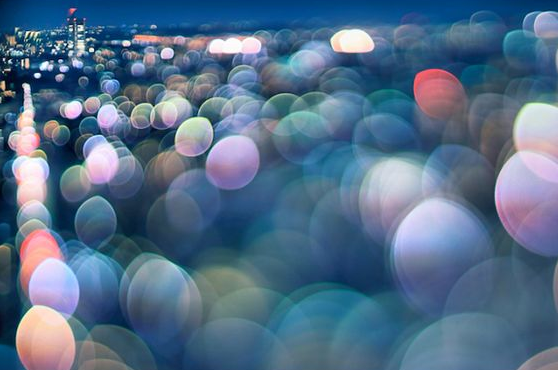
This is my second favourite photograph from Kitamija's collection of bokeh images. This image is very different to the first one i spoke about. I like this one because it is lighter in content, as well as this i really like the colour scheme he has gone for in this, the use of blues/greens/teals have created a calm mood and relaxing atmosphere. Unlike the first image i feel with this one it's one which you would like to admire. I would also like to be able to create this sort of atmosphere and feel with my own images to vary them in impact. The way the photographer has allowed the reflection on the river be quite noticeable is an appealing feature to the image.
|
|
|
these two images are another few which i like from the collection. I would say that these two images compared to the ones above have a different effect to them. They both appear more blurred in many areas, although i like these images, the blur inst the my favourite part. However in the first image the photographer has filled the frame once again, i do like this as it creates a sense of excitement in the photograph. As well as this he hasn't made the entire image bright with colours, he has only chosen certain parts. The second image is more brighter in colour, i like this because it isn't too much, furthermore i like the scheme of colours in this, and the reflection on the river.
Recreation


Photoshoot 1
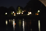
This shoot is my first for lights. This photoshoot was my first time experimenting with long exposure. I took these images in Richmond, i feel that for my first attempt at this it was a successful shoot, apart from some images with poor composition. My aim was mainly to capture the traffic through long exposure and bokeh through adjustment with the focus.
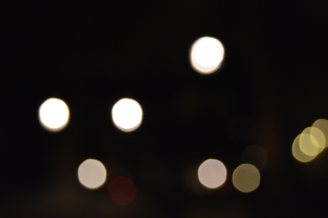
This is one of my favourite images from the photoshoot. I like this bokeh photo because of the way the subject is framed, the bokeh lights are centered in the image which allows them to be the main focus. I also like this photo because the reflection of the light on the river has been captured, which is adding to the lights and theme of colour in this photograph. Not only that but the clarity of these light bokeh, in my opinion are perfect and the size of the bokeh is subtle - implying a lighthearted atmosphere and relaxed mood, somewhat romantic. Lastly i appreciate how the colours and bokeh lights are vivid and quite bold.
|
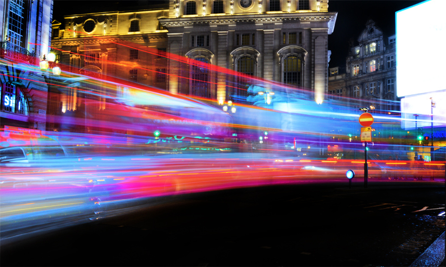
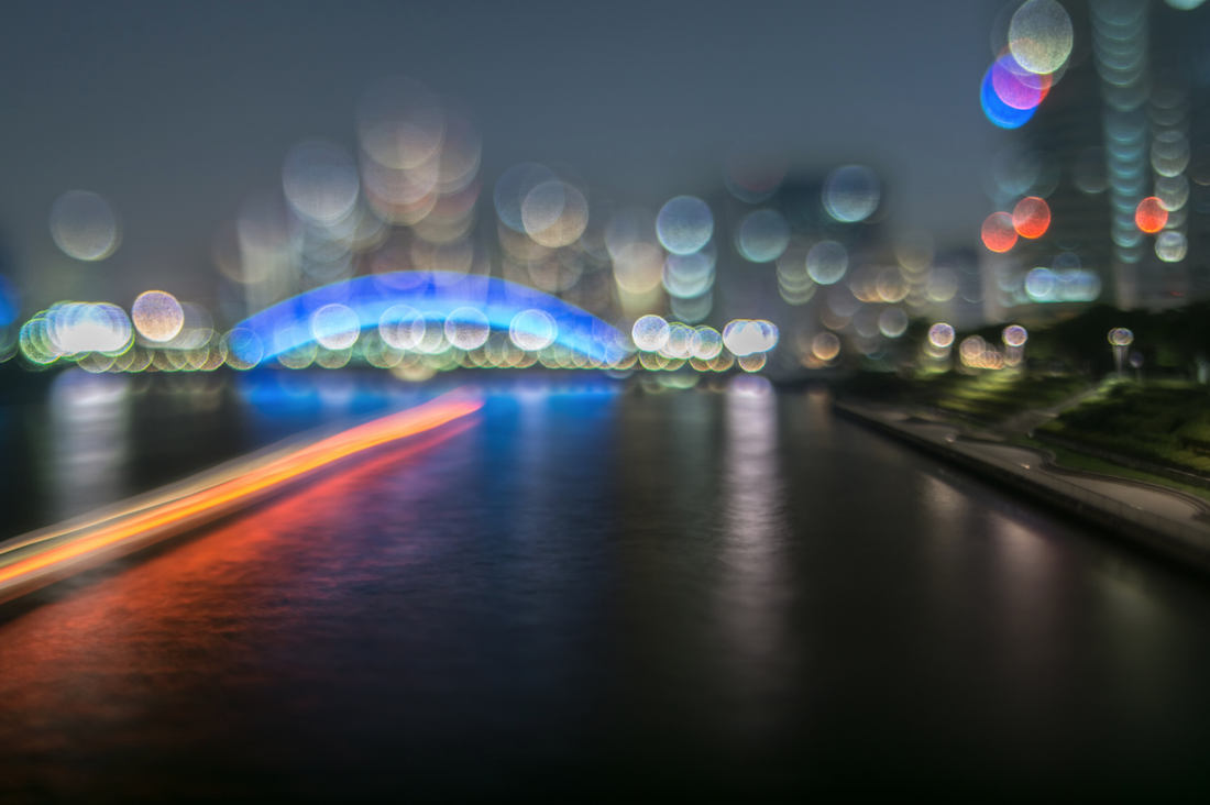
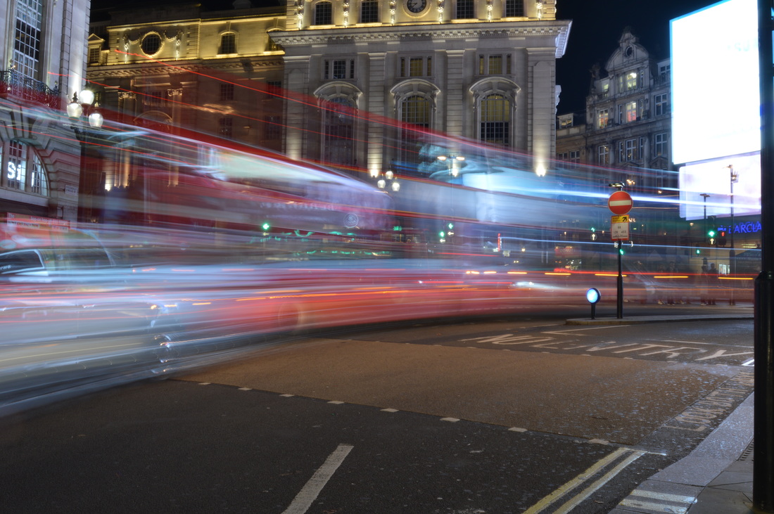
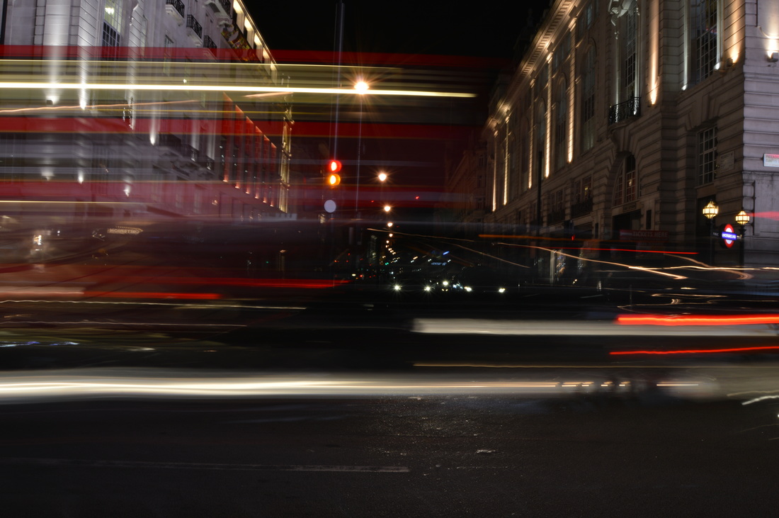
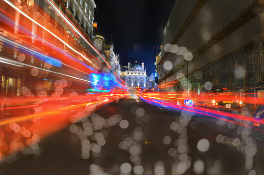
This photograph is my most favourable out of the traffic collection. I like this one a lot as the subject fills majority of the screen, as it's a bus. Not only that but the beams of light are consistent and don't break up, as well as this the lights have a few different colours which add interest to the photo. This image gives off the atmosphere of speed and an surreal escape. Lastly i think the use of natural lighting has worked well ad the time of day i have chosen to take this has allowed me to capture the detail i need. I would take this image to photoshop and experiment with overlapping.
|
|
This image is one which i experimented with during the shoot. For this photo i used long exposure, however i did zoom in and out of the frame with the lens - causing this 3D effect. |
Photoshoot 2
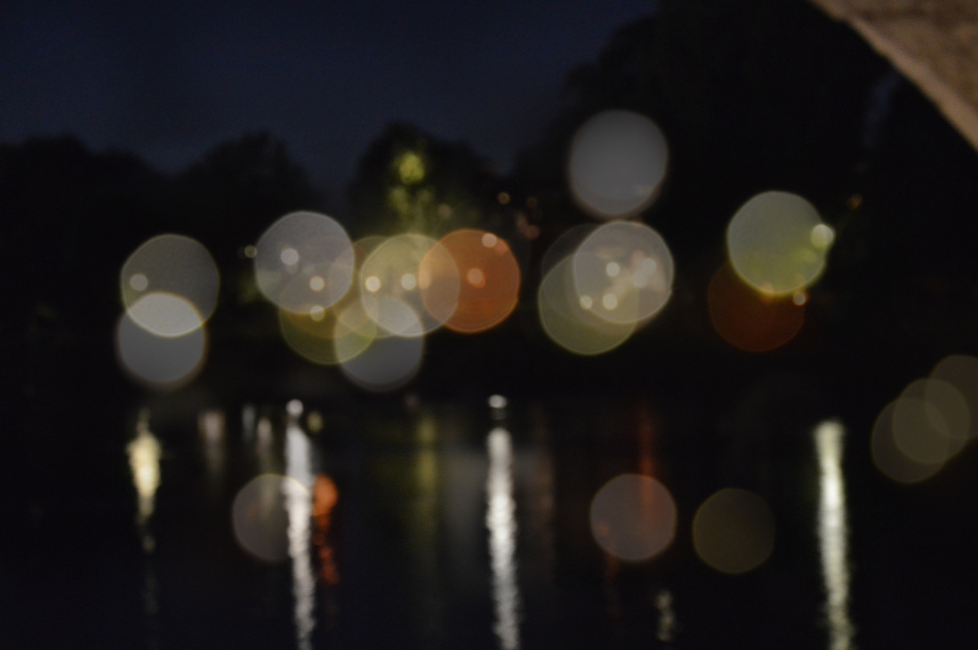
This photoshoot is again bokeh and long exposure with traffic. For this one i decided to do this shoot in London, at Trafalgar square, Oxford street and Southbank. I think that these images are more successful than the previous photoshoot. For some images i tried something new and moved the camera up and down and like before used the lens to zoom in and out. My aim with bokeh lighting was to play around with the manual focus to see different sizes of the bokeh and which looks better.
this is definitely my favourite image from the traffic collection of photos I have from this photoshoot. I especially like this one due to the consistency of the subjects long exposure. Furthermore the lights in this image are quite vivid and when photoshopped they can be enhanced more. I also really appreciate the way I have composed the image, I have framed the subject so that they take up a event amount of the frame and stay the main focus - as you can see there are no other vehicles in the way. In this photo I have captured multiple busses so that there would be more light and movement to look at.
|

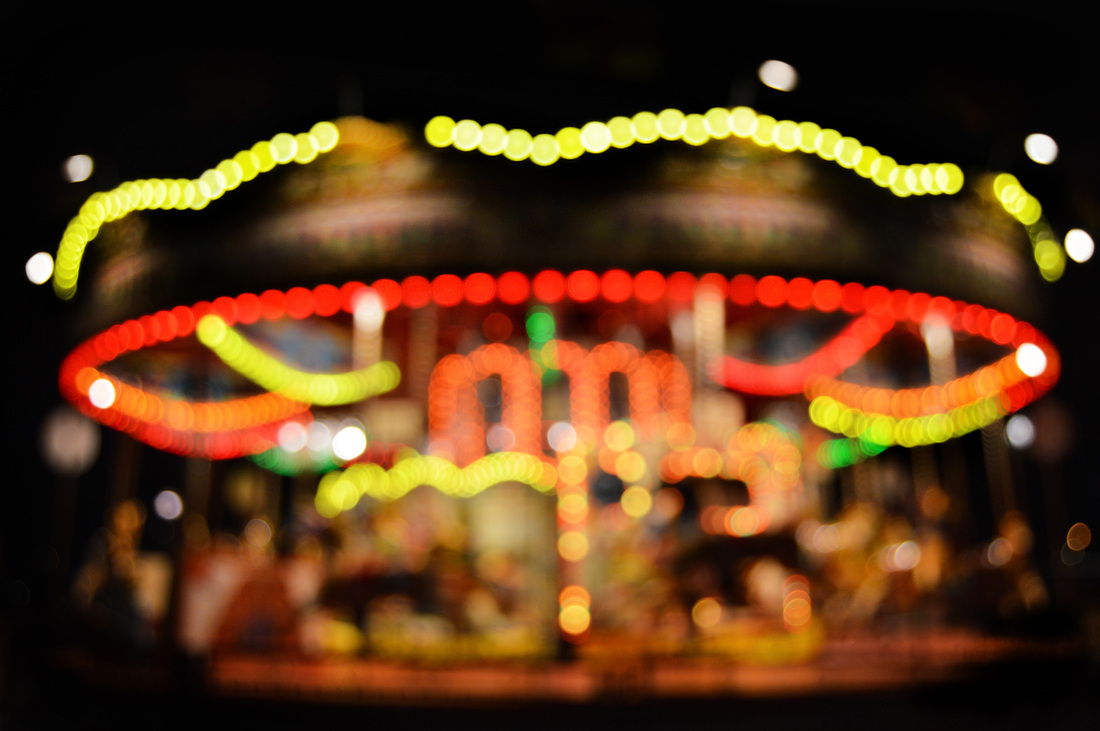
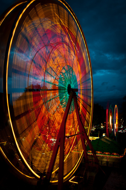
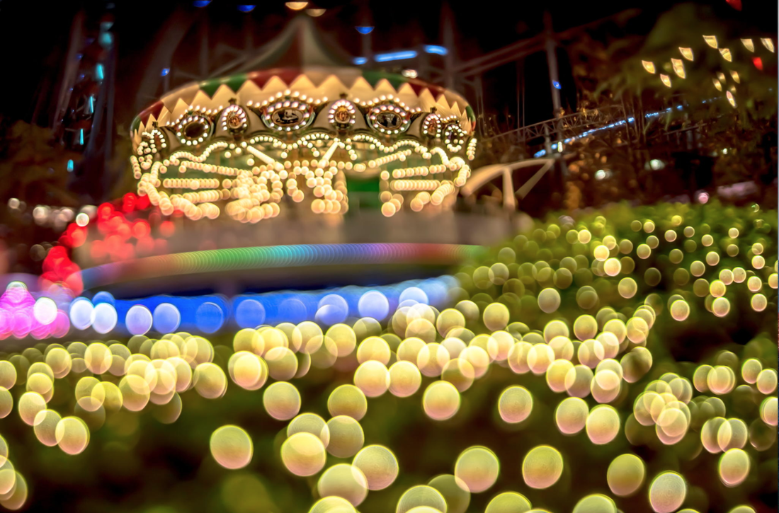
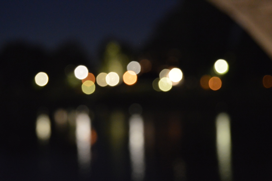
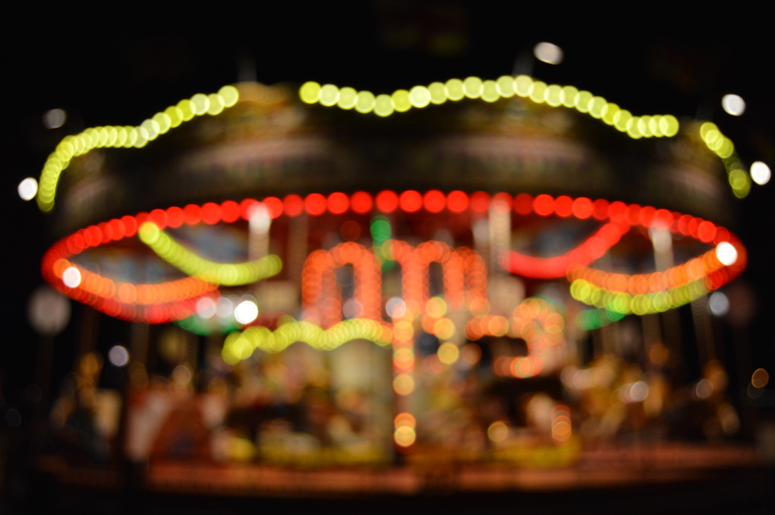
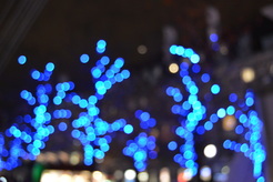
i really like this image from the bokeh photographs I took. This is because even though the image is blurry you can figure out what the subject is - merry-go-round. Also as this was taken at night the subject has become ultimately the only focus of the image because the background is completely black. I like this photograph because it sets the mood of fun and mystery. And it allows the atmosphere to be joyful as it can remind people of being a child, it portrays the feeling of escape.
|
Photoshoot 3
This photoshoot was done in my garden. For this i used an iPhone torch light, for this i decided to use inspiration from one of my artist researches, therefore i asked for random images to be drawn as well as powerful words.
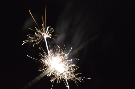
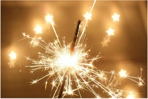
This is one of my favourite images from my light shoot. This is a sparkler, with this photo i used the manual focus on the camera and also used long exposure for this. The long exposure used on this image was for a very short time, as you can see that there is one movement of the sparkler shown. I really like the clarity of light and textures in this image. Furthermore more i like how the smoke from the sparkler has been captured.
|
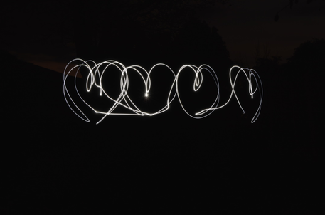
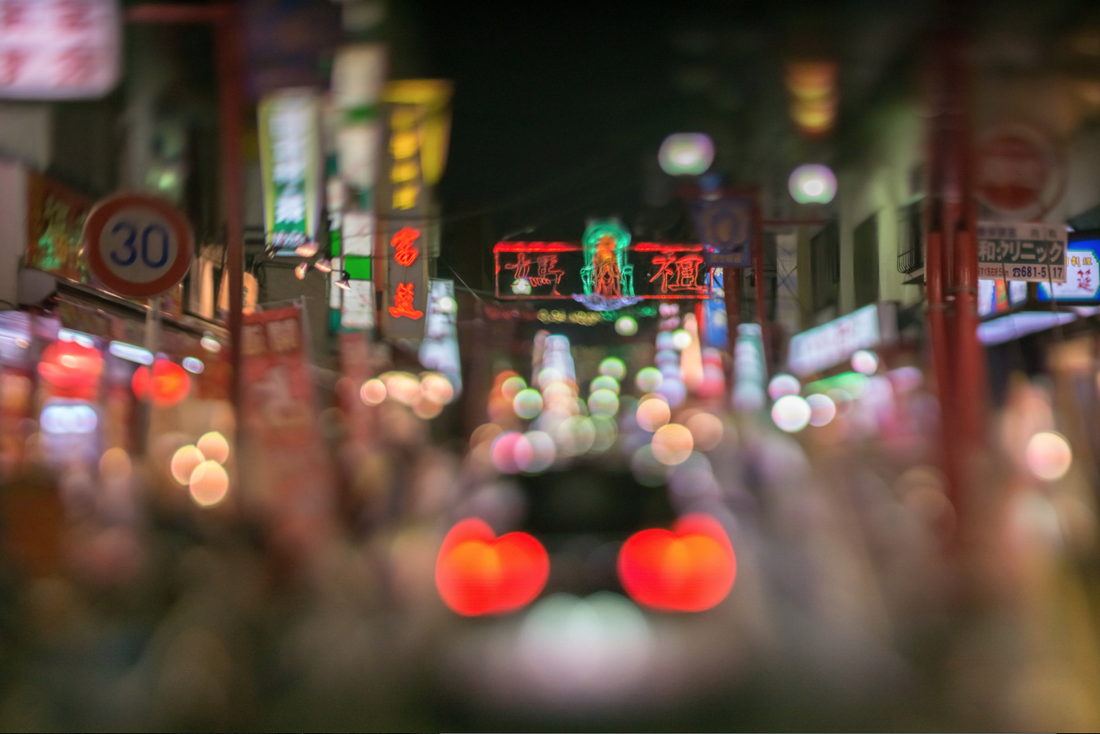
This is my second favourite image from the light collection, I like this photo because of the way i have composed it, i have made sure that the hearts have been placed in the centre of the image. Furthermore i like the way you can see the sky in the background, at the top. As the camera was on a long f stop it allowed the sky to become apart of the image, which i feel begins to replicate Bosanko's work. I would like to recreate these with much more of a setting included.
|
Photoshoot 4
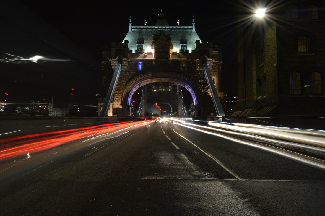
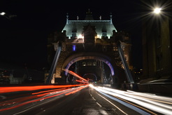
This photoshoot was in London - Tower Bridge. I chose this location as i knew it would have good scenery/lights for this subject, furthermore Tower Bridge looks good in pictures and would make long exposure not boring and repetitive. The aim for this shoot was to capture the the lights of the traffic coming in and out of the bridge as well as bokeh images of the buildings you can see from the bridge.
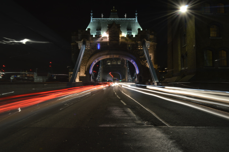
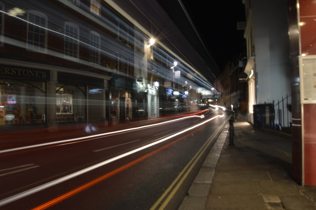
This is the image the i like the best out of the long exposure shoot. For this photograph i stood at a crossing in the middle of the road. I think this turned out well because the light from the cars were captured well, and it isn't overexposed. Furthermore the bridge is lit well so you can see it clearly. I did this at a good time of the day so that the natural lighting worked well with the light through long exposure.
|
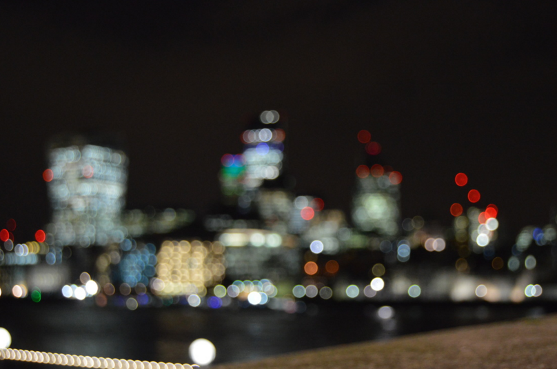
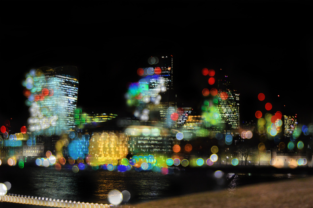
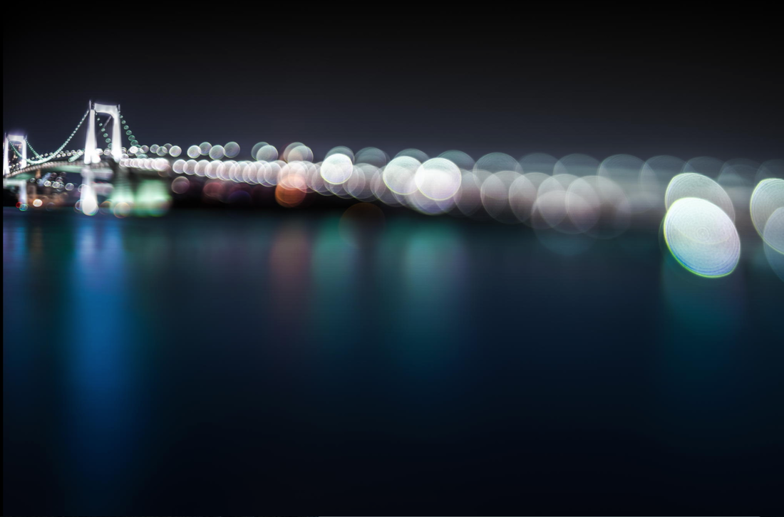
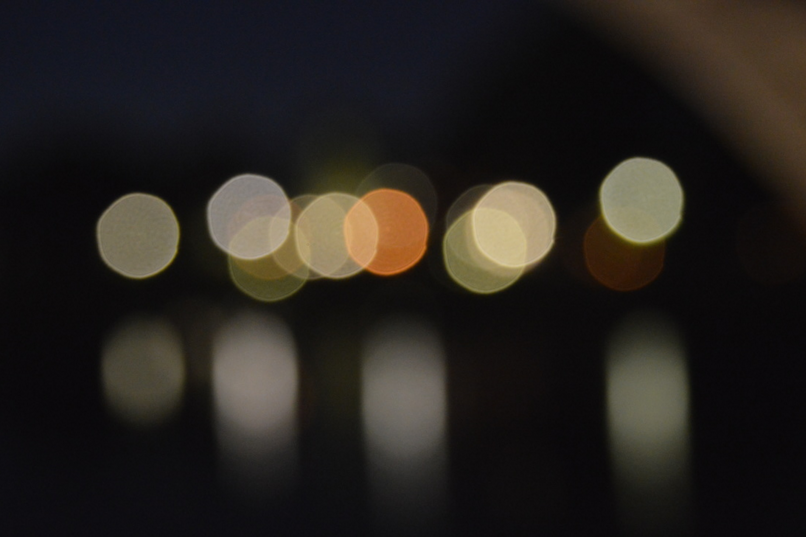
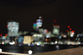
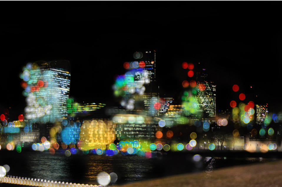
This is my favourite photo from the bokeh photographs i took in this shoot. I like this because unlike my other attempts at bokeh photography the image is mostly filled with bokeh lights. I like this as it creates a good lively atmosphere and is very clear that this is a busy city. Furthermore i used manual focus when taking this, and so i was able to control how blurred or clear i wanted the image. I feel that i chose a perfect level of clarity to depict the bokeh lights of the buildings.
|
experimenting with lenses
|
|
These photos were experimenting with three different lenses. I used the three various lenses and experimented with them. Furthermore i only used long exposure to capture traffic and more light in the images.
|
Experimentation
|
this is e of an experimentation I have completed. I feel that this experimentation turned out decent, however I know it needs improvement. I don't think i was successfully able to portray the theme of colour in this image. i overlayed 3 different pictures on this and enhanced colours using the sponge tool. As well as adding layers and using the paint tool to add more colour with the overlay hard light. |
|
Before:
|
After:
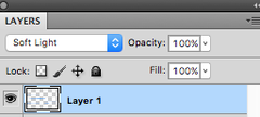
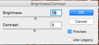
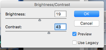
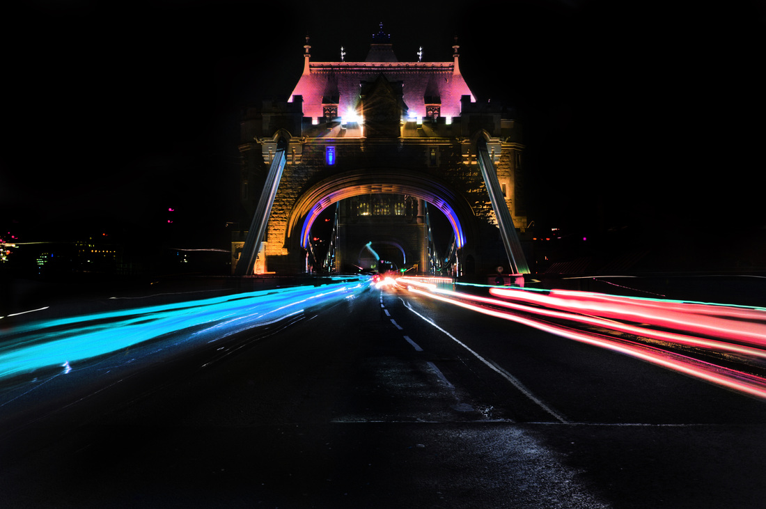
Here is an image which i have edited from my shoot in London. For this photograph the first thing i did was adjust the brightness and contrast. After this i used the sponge tool to enhance the coloured lights in the image that i wanted. I then used the burn tool and made the floor darker. To portray the theme of colour i i changed the hue/saturation of the image, i duplicated the layer, i found that i liked the pink/purple look when experimenting and stuck to this. Then using the eraser tool i removed any parts which i did not want to be pink or purple. Lastly i created another layer and incorporated blue into the photo for colour difference. I overlaid this with soft light and using the paint brush i applied long strokes which emerged with the bus.
|
|

For this image i only used the sponge, burn and dodge tool. I enhanced certain colours with the sponge tool, i used the burn tool on 'shadows' and uploaded this to the border of the image. This way the booked lights would be more vivid. Lastly i used the dodge tool on certain bokeh which i thought that needed to be lightened. My aim for this photograph was to have the saturation of the image to be quite intense but also give of a playful atmosphere.
|

|
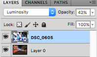
In this experimentation i used the two images on the left. Firstly i edited the original image which i used, on this i used the sponge tool to really enhance the colours of the light, attempting to create a neon effect. Secondly i used the burn tool on the floor of the image and the sky so that the main focus of the photo stood out. i then overlaid the second bokeh image over this, i played around with the overlays and found that i liked 'luminosity' the most on a opacity of 42%. i used the sharpen tool to allow the lights to be more vivid.
|

|

For this photo i began by adjusting the brightness/contrast, i then used the burn tool in 'midtones' as well as 'shadows', i applied this to the road and to the sky and to some parts of the buildings. Furthermore i used the sponge tool to make the light colours bright and bold. I also added a new layer and with a paint brush i overlayed purple into some areas of the buses lights. Additionally i used the sharpen tool to make certain details stand out, and i also used the sponge/dodge tool for the reflections on the floor of the photo.
|
|
|
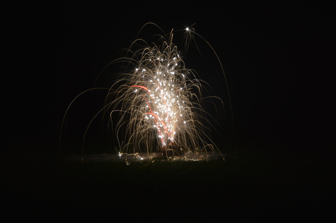
This was a quick experimentation that i did with a fountain firework. I used long exposure to capture this. Firstly i adjusted the brightness and contrast, then i duplicated the layer and decided to change the hue/saturation. I played around with this until i found a colour that i liked. As you can see i left it on purple, i then used the eraser in the center of the firework to bring back some of its original colour. I then used the burn tool on the setting 'shadow' and used this tool on the grass below the firework.
|
Firstly i duplicated the layer and overlaid it with the bokeh image and turned the opacity of this down to 85% so you can still see the image underneath. i used the eraser and removed everything on the image being overlaid and just left the bokeh lights to be visible. I then adjusted the brightness and contrast. I used the burn tool in 'shadow' on the whole sky and parts of the river, furthermore i used the sponge tool on the bokeh and reflections on the water, next i decided to take the clone tool and clone various bokeh lights into places where i thought was necessary. Once i had finished cloning the bokeh lights i increased their saturation with the sponge tool again, his was to give it that neon/electric effect.
|
|
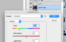
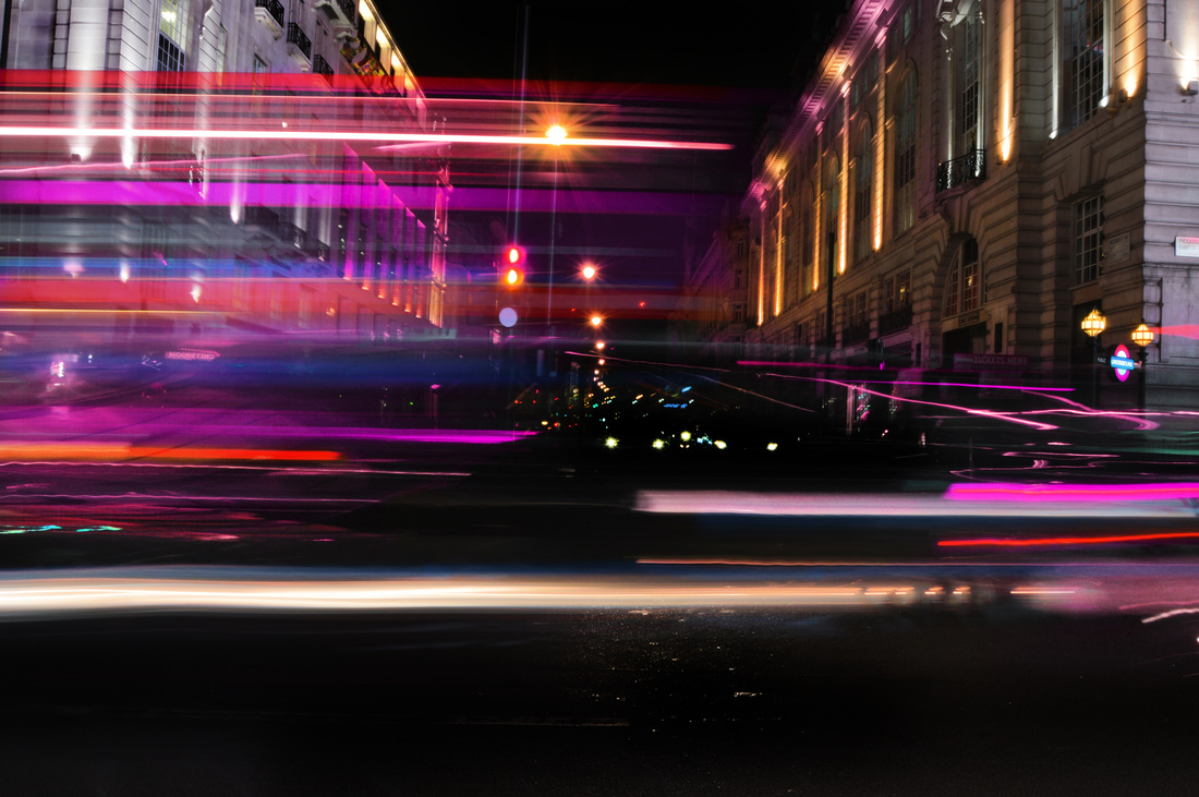
For this photo i firstly duplicated the layer, with this layer i then changed the hue to -45, by doing this i created a neon blue on the stream on traffic lights i decided to keep one side blue as well as the colour that the top of the bridge turned and erased the rest so it was back to its original colouring. I then added a second layer which i made the hue +126, this created a neon red on the right side of the traffic light beams, i erased the rest of the hue on the image and left the beams red. Furthermore i added a third layer and after using the burn tool on the sky i painted in all black apart from some minor lights. I used the burn tool on the floor of this image and then the dodge tool to enhance the wet reflections on the road. Last but not least i took the sponge tool and went over all areas with colour and intensified the neon effect.
|
|
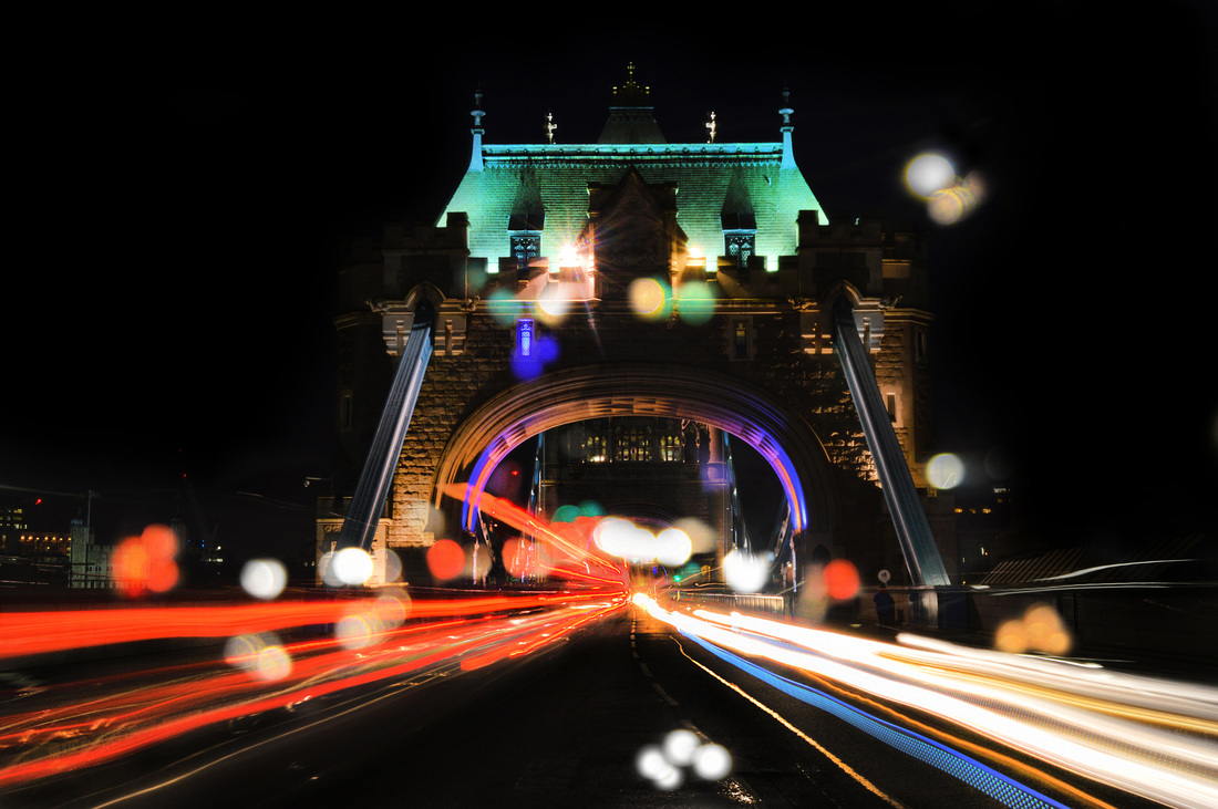
For this photo i began with overlaying the bokeh image over the long exposure one - i used the overlay 'screen' for this image. i then used the eraser to remove all parts of that apart from the bokeh light. once i had done that i duplicated the layer and then used the clone stamp tool to create more bokeh where i think was needed. Afterwards i added a layer and on this i painted the sky black for a pitch black sky. Then with adding a second layer i created a yellow beam on the right side of the traffic and overlaid it with soft light. Last but not least i used the sponge tool on all the lights and the sharpen tool on the whole image.
|
Final Pieces