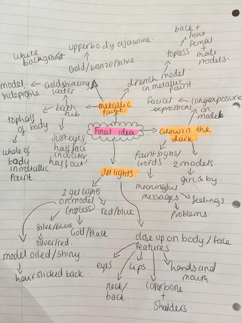
FINAL IDEA
For this page i will be exploring metallic paint on models. My main aim for this page is to photograph different metallic coloured paints - bronze, gold, silver. Throughout this page i will be exploring how to successfully capture paint in its raw textures and being poured onto people, on their faces and bodies.
Moodbaord
|

|
|
Ideas
|
|
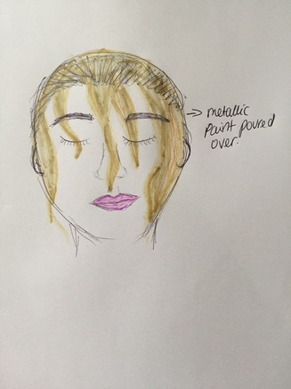
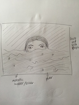
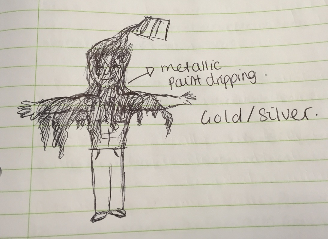
these were my initial ideas for this page, for the first sketch i wanted create an image where the model is eventually drenched in metallic paint - gradually. I want to do this withhold or silver paint, i would begin with drenching body parts to begin with - arms, hands, shoulders, neck. The second image is hopefully a model in metallic water half of her face or her side profile.
Final sketches
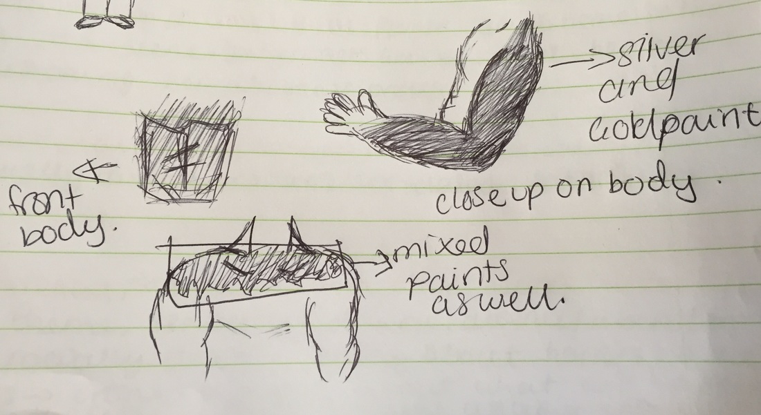
this is the final sketches for this page, i will use gold and silver paint for both of these sketches, i will do the shoot with the paint dripping all over the model in the green room, i want this to appear clean and sharp as i want these to be my final piece.
|
|
Brainstorm
Ian Crawford
|
Ian grew up in Africa and developed a passion for photography at an early age. Iain loves to capture images that have a strong graphic and textural quality, often searching out the graphical symmetry in chaos, while still maintaining the personality and emotion of the subject. |
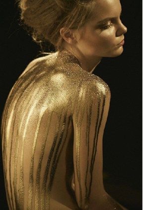
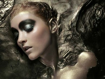
I really like this photograph from Crawford's metallic collection. I especially like this image because of the use of colours in this, the gold and white liquid surrounding the model go extremely well together. Not only this but the way the liquid appears to be splattered outwards from the model creates a very dramatic atmosphere to this photograph. The hints of green shimmer used on the model add depth and contrast to the colour palette used, and is quite engaging for someone to look at. The model has been portrayed in a 'damsel in distress' yet beautiful light and this is something i would like to emit from my work as well.
|
This second image is another photo i like due to the colour range as well as composition. I like the simply uses of purples and blues which sit next to each other on the colour wheel, the colours are similar yet jel really nicely together. the main aspect of this image that caught my eye was the composition, the model has filled half the frame and been captured using the rule of thirds. I particularly like the way the photographer has taken this because of the rules he has used, i think it has made the photo more intense and questionable as to what the story behind the photo is. Also the white background and lighting reflect well off the colours and the facial expression is shown clearly.
|
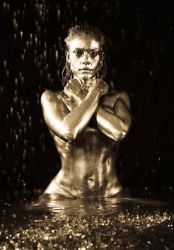
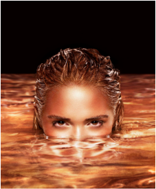
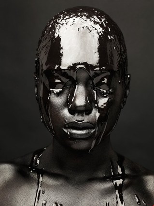
these last two photo's were brought to my immediate attention simply because it's unusual to what i've seen before but they look amazing. I assume that these have been taken in a large tub along with the first photograph i spoke about from Crawford. The most impressive part about these images are that the liquid they're lying in are completely metallic and produce a mystical mood, i instantly think about adventure films when i look at these, the first one suggests a lighter more optimistic atmosphere and the second suggests a evil yet magical theme to it. The lighting in both of these shine off the face and body accurately and highlight features of the models. Furthermore i like that these of close ups so that nothing can distract the viewer, also the illusion can not be broken by being this close into the image.
Pinterest Collection
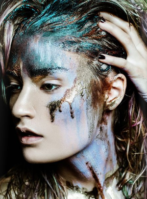
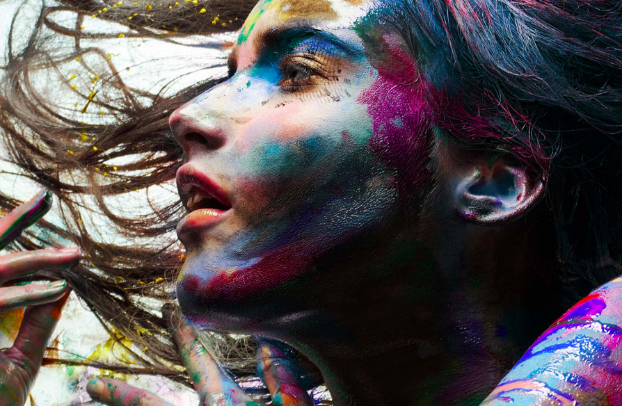
i like this photograph mainly because of the way it is taken, the photographer has filled the frame with the model - the close up on the model has allowed the whole face and hair to be seen, i like this because we are able to see the details and textures of the metallic paint in the models hair. Furthermore i have noticed how the model has been made to look extra pale with no makeup, this has allowed the colours of the paint to stand out further and be the main focus of the image. Lastly, unlike the other images this has been made to look messy and carefree, i like this effect and atmosphere that the photo emits, it also seems it may have message or meaning being it as the model looks troubled or stunned.
|
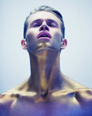
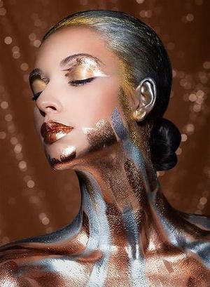
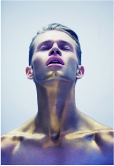
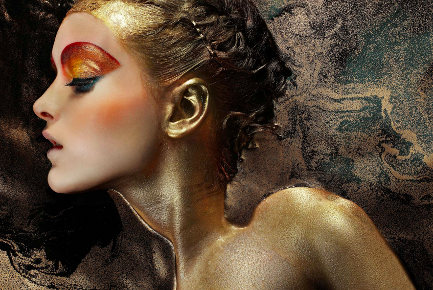
This is one of my favourite photographs from this collection, i really like this photo due to the way the model's face and body has been defined - the use of the gold paint has created depth within the models upper body structure, this therefore produces a contrast within the gold metallic paint with some parts dark and some parts highlighted. Additionally the whole image has a blue/purple tint on it, however it is most noticeable on the bottom of the photo, this tint reflects off some parts of the model and creates a different metallic tone which works well with the gold. Lastly i appreciate how the model is posing in this, i think it's different from the typical positions of these other images, and it draws more attention the the paint on his shoulders and neck.
|
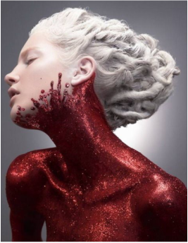
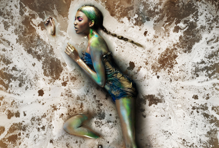
These last two images are a large inspiration to the work i will try to produce on this page. I especially really like the first one, this is because of the colour pallet used, the whole image is silver/grey and has been desaturated, also i like how the metallic paint has a real shine to it, it almost looks like melted metal. Not only this but the models colour bones have been highlighted as well and this allows depth to be created in her body structure. The second image is very different in my opinion, they both hold the same idea and concept however the first one is very neat and perfected. This second one, the paint appears messy, but i like how all the accessories and makeup have matched the colour of the paint. I would say with this and the black background the model stands out a lot and the gold theme is successful.
Recreations
|
|
|
Photoshoot 1
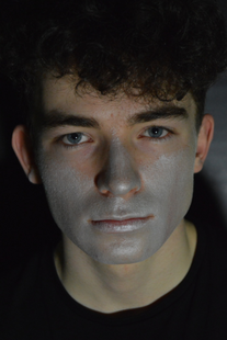
This photoshoot was a test shoot to how to capture the metallic face paint, and the shimmer i it, i began with three different colours - bronze, silver and gold. However after taking a few photos i realised the silver shone and stood out more as metallic.
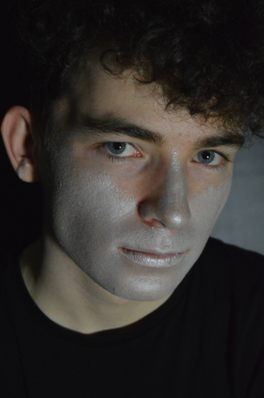
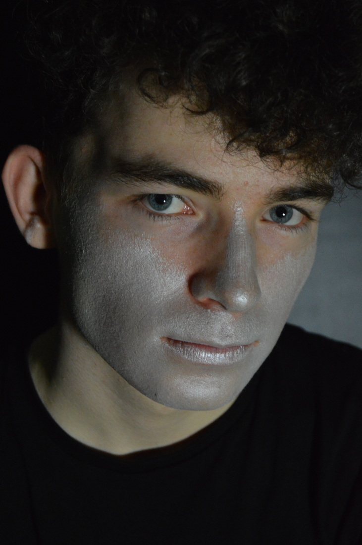
This is my favourite photo from this photoshoot, in this i used silver metallic face paint. To begin this was a test shoot to see how the paint would appear on the model. I attempted to use bronze and gold as well, however these didn't work as well as the silver. The silver shine works well with the models blue eyes. Furthermore i like the composition, i have created these mood and serious atmosphere.
|
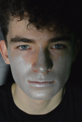
This is the second photograph that i like from the shoot. on this photo i have used split lighting, i like this as i've created a clear contrast with light and dark on the face, this once again allows there to be an intense and engaging vibe/atmosphere. Moreover, I've centred the model and filled the frame so that his eyes and the paint is the main focus.
|
Photoshoot 2
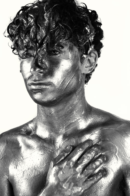
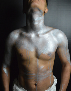
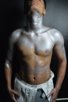
For this shoot i did it in the green room on a black background, i think that the black and the silver would work well together and help bring out the silver metallic paint. My aim for this shoot was to capture detailed photos of the paint on the body and the texture of it, also i wanted to photograph the cuts/muscles of the body with the paint on it.
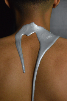
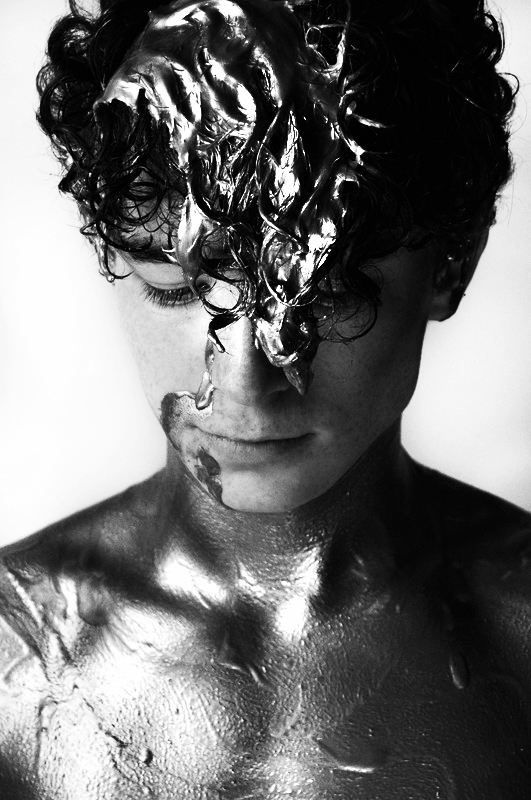
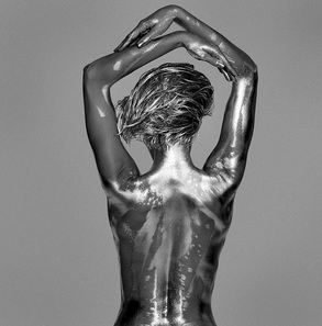
this is one of my favourite images from this shoot. This was shot in the green room with a black background. I really like this photograph due to the fact that the back is completely clean and the metallic paint is slowly dripping down the back. The simplicity of this is what i appreciate the most. Furthermore, i decided to choose to use silver paint for this shoot because it would contrast well with the background and the warm tone of the model's body. I like the lighting in this photo because it created a small shadow on the dripping paint, as well as this it has made the dip down the center of the back to be more prominent.
|
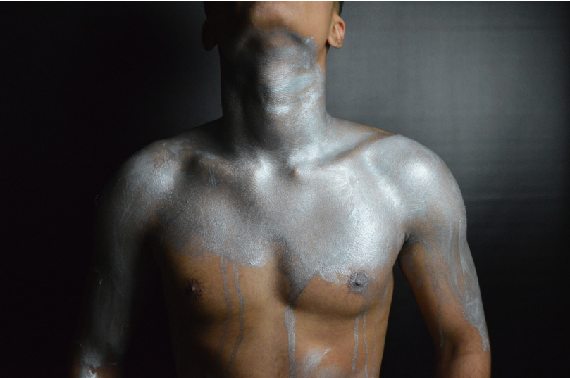
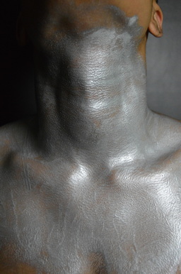
This is another one of my favourite images from the photoshoot. I mainly like this photo because of the lighting, i used rembrandt lighting for these images. Secondly, i asked the model to raise his head in most of these images, this was due to the fact that i put the paint on his neck so when the neck is visible and with the light hitting it, you are able to see the definition and structure of the collarbones and neck. Moreover, i particularly like the lighting because there is a clear contrast from the right side of the image to left side, it also allows parts of the body to appear more defined. The shadows on the body make the photo more visually appealing.
|
Photoshoot 3
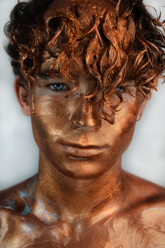
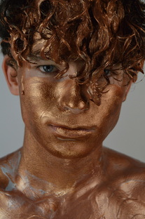
This photoshoot was done in the green room on a white backdrop. I chose white because it would contrast well with the bronze metallic paint, the white would also reflect well with the light enabling the paint to shine even more. The aim for this shoot was to capture the paint dripping on the model, as well as the paint being carelessly placed on the model and his hair.
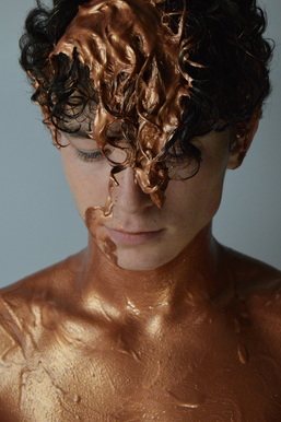
This is one of my strongest images from this shoot, this is because of the composition of the image. I used bronze metallic paint on the model, i asked the model to look down,i really like how this turned out because you can see the paint in the hair and in the body, but you can still see the models face and structure of it. Moreover i really like how i have captured the paint in the hair, the light has allowed it to reflect and appear even more metallic and shiny than it already is. Lastly, the use of a close up on this photograph has given me a sharp image and really focused on the paint.
|
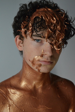
This is another one of my favourite photos, i like this one particularly due to the facial expression on the model. I like that he is serious and looking directly at the camera, it has created an intense atmosphere. also the models eye colour is very distinct and the bronze metallic paint helps bring it out. Furthermore i had only put the paint on up to his neck, i think this looked good because it was bizarre, it almost looks like a bodysuit on the model, and i like this its as if its an illusion to to the model wearing clothes.
|
Photoshoot 4
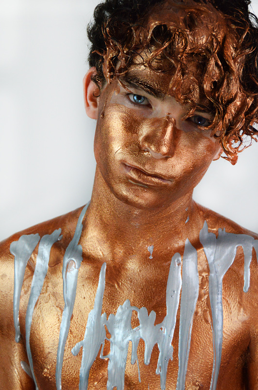
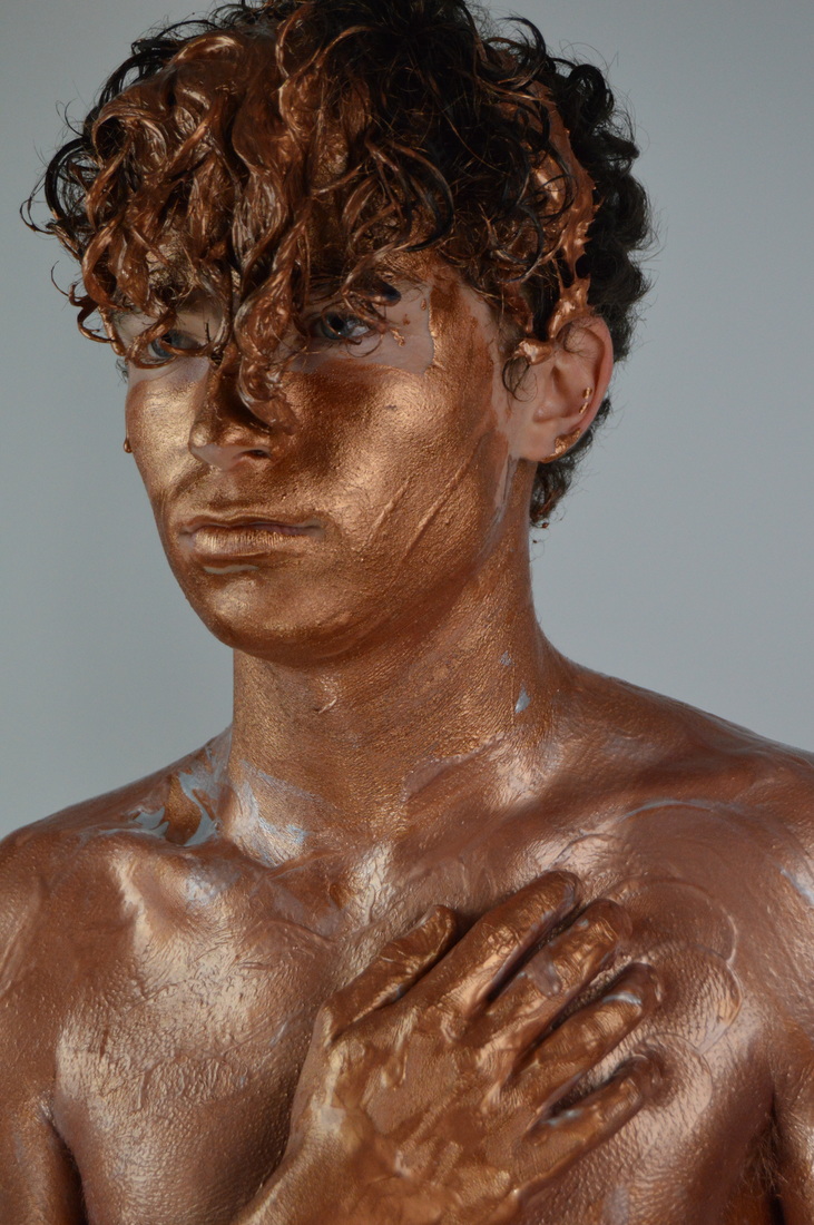
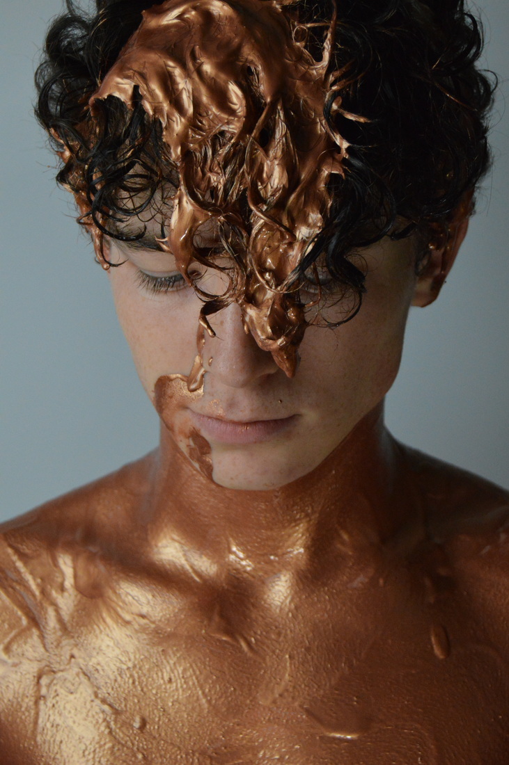
This photoshoot was done in the green room on a white backdrop. I chose white because it would contrast well with the bronze metallic paint. The aim for this shoot was to capture the copper/bronze metallic paint all over the model, plus i added silver into the mix to spice up the colour scheme.
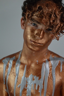
I really like this image, its definitely a favourite of mine, in this photo i poured silver metallic paint over the bronze metallic paint, i wanted to break up the continuity of bronze and create a contrast with the colours, i think this worked and the colours compliment each other. I also like the way i have composed this image, and i asked the model to tilt his head just to change up the poses, which turned out really successful. I am going to edit this image and attempt to make it a final piece, because i feel that that the eye colour really stands out in this photo so i would like to enhance this.
|
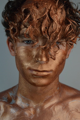
This is by far my favourite close up from this shoot, at this stage i had asked the model to mix the silver paint in with the bronze, this actually created a really nice rose gold colour on the body which you can see briefly on the upper body of this photo. Furthermore i like that i left the hair in front of the face, because this way only one eye is completely visible, and this adds a more personal/intense mood to the photograph for whoever is looking at it. Moreover, the composition of the image is what makes it a strong photo, it's a close up and that way the face is in complete focus and the textures of the hair are visible.
|
Experimentation
|
Before:
|
After:
|
|

|
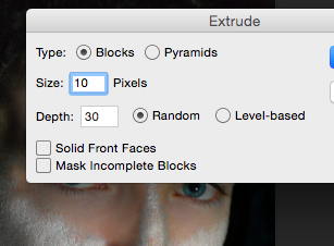
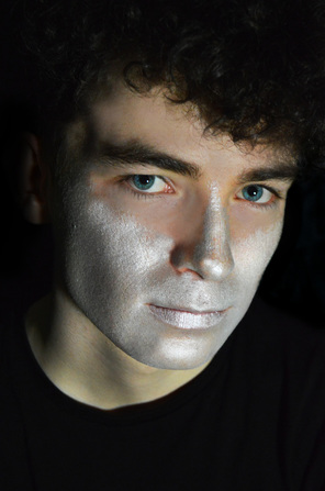
This was a simple edit, however i do like the way it turned out. I firstly adjusted the brightness and contrast, i then took the burn tool in 'shadow' and used the to make the background completely black, i also used on the paint and where there were metallic dark line, so i enhanced them with this tool. Next i used the sponge tool and applied this where i used the burn tool, because i could see that there were hints of blue coming out and i wanted to make this more obvious as it makes the photo more visually interesting - in the details. Next i used the dodge tool in 'highlight' and used this everywhere where there are reflections and really wet paint, this just makes the photo seem more 3D and all the features and textures are accentuated. I also used the sponge tool to desaturate the models skin colour and this was taking away from the metallic paint. The last thing i did was sharpen the image a lot.
|
|
|
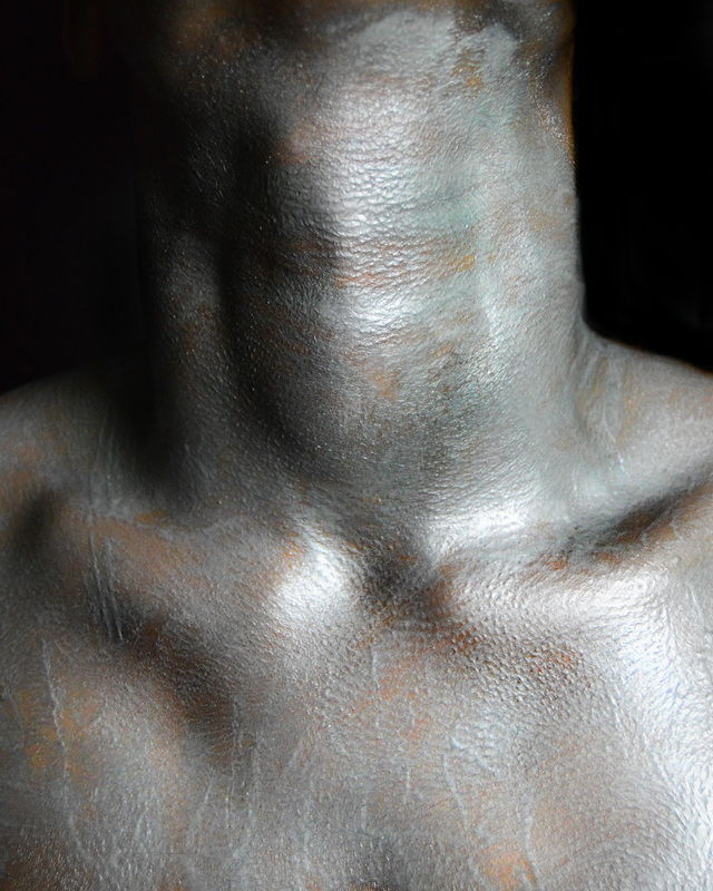
This was a simple edit which i did, i like the outcome of it, although i think it would of looked better if the paint was initially a little bit thicker. Firstly i changed the brightness and contrast, i then took the burn tool on 'shadow' and applied this to the background and on the neck and collarbone to create depth and contrast and define the upper body. The next thing i did was crop the photo so that it was solely focusing in the models neck and collar bones, after this i used the dodge tool in 'highlights' and used this next to areas which i used the burn tool on, this created further contrast on the body and allowed the metallic paint to shine much more. I used the sponge tool and lightly went over areas of the paint to enhance the colour, this ended up giving a slightly blue tint to the paint which i liked. Lastly i sharpened the image.
|

|

|
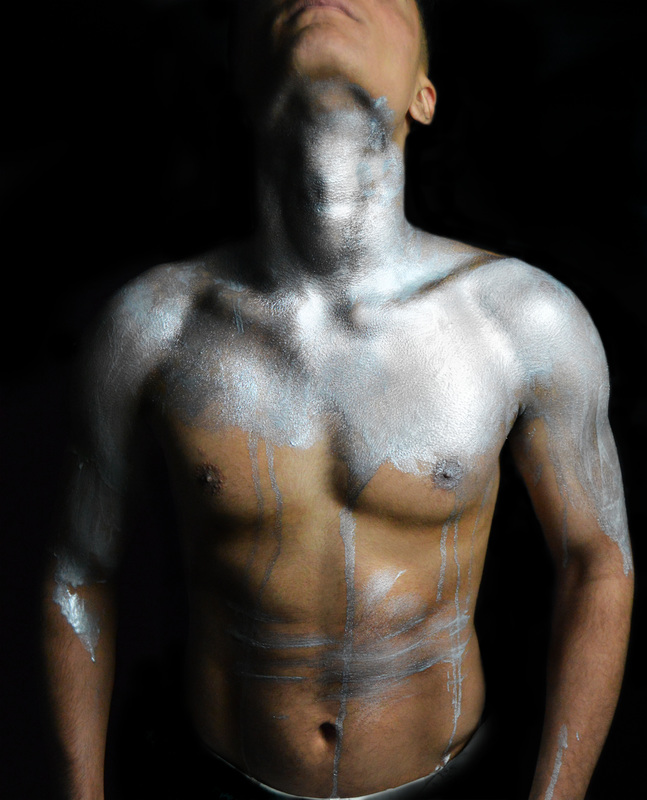
I'm really pleased with this outcome, I began with adjusting the brightness/contrast, i then used the burn tool to make the background black, i created a new layer and with black paint i covered up the towel in the image. I used the burn tool on the body to create a lot of definition and enhance the appearance of muscle. I then went in with the dodge tool and highlighted the metallic paint to make it shine more and stand out. I used the spot healing tool on the models face and to remove any blemishes on the body. I added another layer and with this i painted over parts of the body with the a similar colour to the skin tone, i did this to create an airbrushed effect and leave the body looking clean and smooth. I used the sponge tool on the paint and this brought out a strong blue tint, so i went back over this with desaturating on a low opacity and i really liked how turned out. I created a third layer and used black paint around the models outline just to create extra definition on the outline. Lastly i used the sharpen tool over the whole photo.
|
|
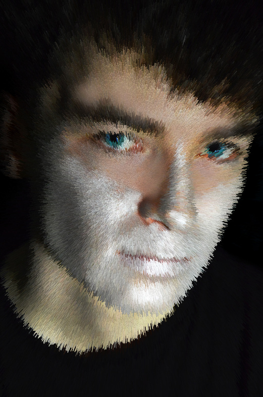
This is one of my final outcomes, i used the dodge tool on midtones and shadows to make the background whiter. I then used the burn tool on the hair to create contrast and on the body's bone structure. I also applied this on the eyes lash line to make the eye colour of the model really stand out. I used the dodge tool in highlights on the eyes and then the sponge tool to make the colour vibrant. Furthermore, using the dodge tool on the body and the silver paint to make that shine more and enhance the metallic effect all over the model. I used the burn tool on the black parts of the hair as well and the eyebrows. To finish off the image i used the sharpen tool all over the model.
|


|

|
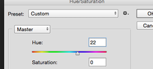
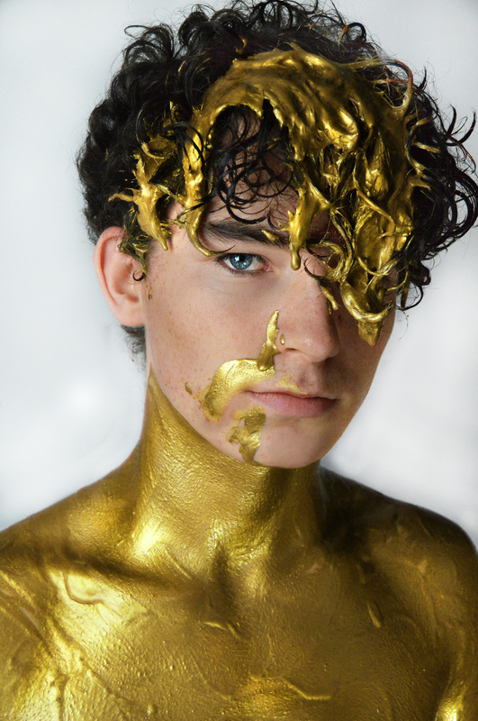
im really happy with this outcome because i was unable to get gold metallic paint. First i changed the brightness and contrast of the photo, then I began by dodging the background and burning the models hair and body definition, and creating contour in his face. i used the dodge tool on the eyes to make the shine more and then i went in with the sponge tool to produce more colour. ANd i used the dodge tool in highlight to make the paint shine a lot more and the cheekbones of the model to stand out more. After this i duplicated the layer and change the hue of the photo to 22. This was a solid gold and i really liked it, i then used the eraser tool to remove the gold from the parts of the face where there was no paint. I then used the healing tool on the face to clean it up and make it looks clean. Lastly i used the sharpen tool all over the photograph.
|
|
|
|

|
|
|
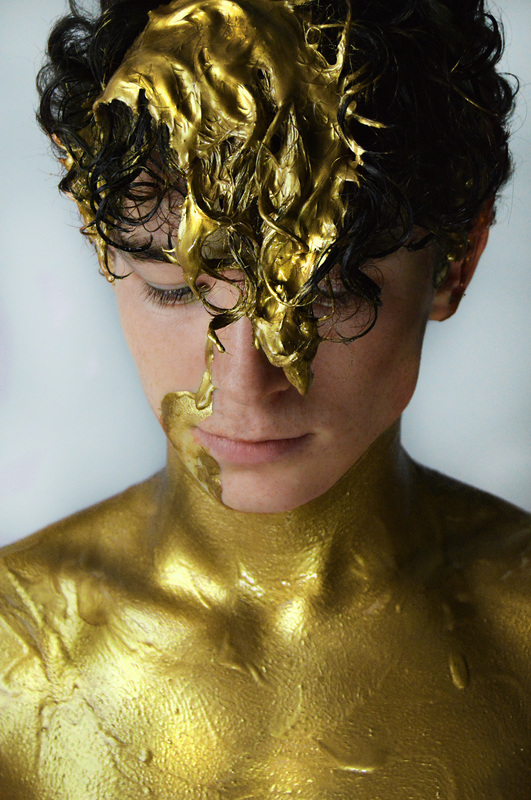
This experimentation was the first one i did when changing the hue. I first adjusted the brightness and contrast, and then used the digde tool for the background and on the body to enhance the highlight and shine. I used the burn tool for the hair and body, i applied this in certain places to create definition and structure. Then i duplicated the layer and changed the hue to to 24,next i used the eraser to remove the colour off the face where there is no paint. after that used the sponge tool all over and then the sharpen tool to increase the details and texture of the models hair. The last thing i did was use the healing tool to remove red blemishes and freckles on the face.
|
|
|
|
|
|
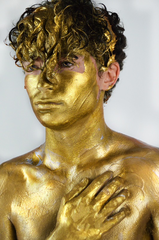
This is one of my final outcomes, and definitely my favourite. Firstly I used the burn tool on the hair to create contrast and on the body to make the bone structure visible. i used the dodge tool on midtones and shadows to make the background white. I also applied the burn tool around the eyes and lash line to make the eye colour of the model really stand out. I used the dodge tool in highlights on the eyes and then the sponge tool to make the colour really bright but also mystical. Furthermore, using the dodge tool on the body paint to make that shine more and enhance the metallic effect all over the model and especially the hair and face. I used the burn tool on the black parts of the hair as well and the eyebrows. To finish off the image i used the sharpen tool all over the model and the sponge tool to bring the bronze/copper out.
|


|
|
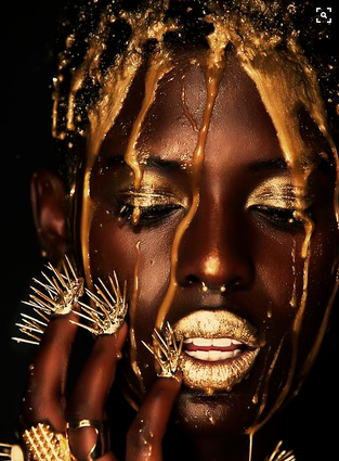
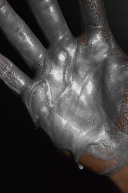
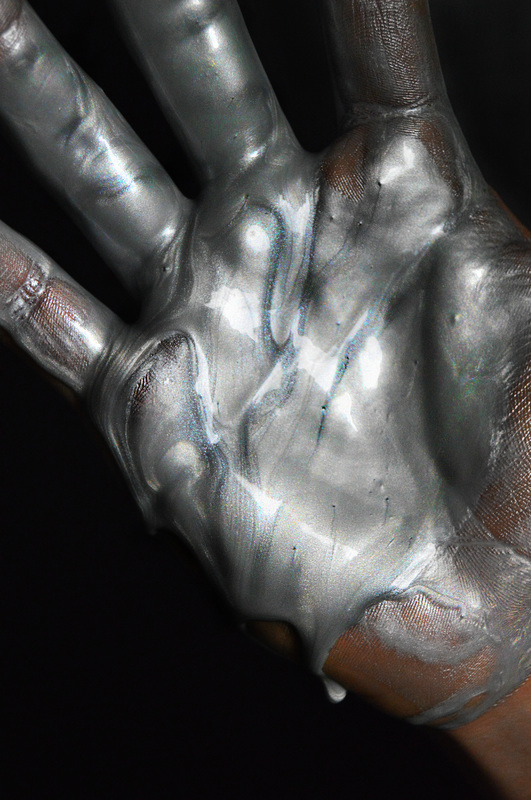
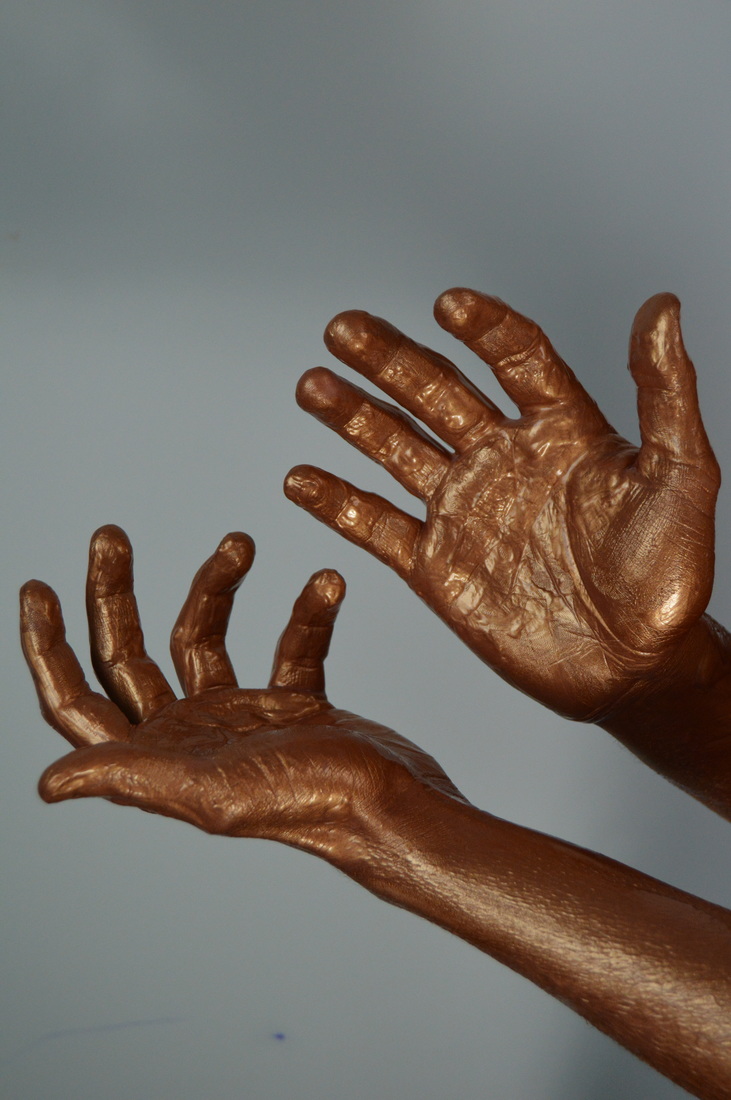
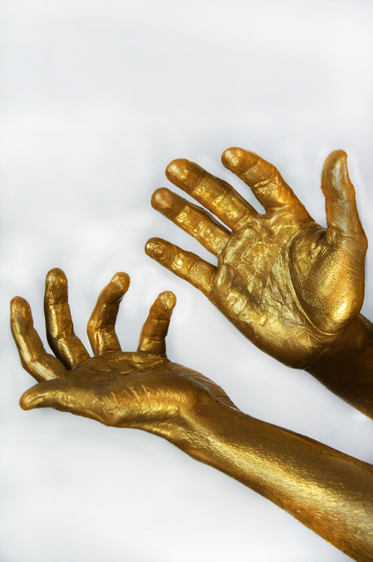
The first thing i did was use the healing tool to remove the ink marks on the backdrop, i then changed the brightness and contrast, after this i duplicated the layer and changed the hue to +24 so create this solid gold colour. Then i dodged the background to make it white, next i used the dodge and burn tool on the hands to create highlight and contrast and make the metallic paint. I then used the sponge tool and made the gold vibrant and almost appear beaming. Using the sharpen tool i applied this all over the hands a lot to make sure the detail and textures were clearly seen.
|
|

|
|
|
|


|
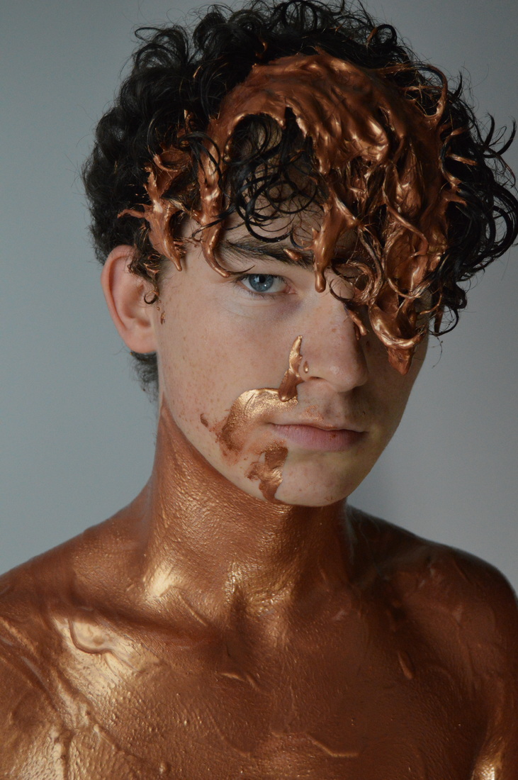
Firstly i increased the brightness and contrast of this image. I then used the dodge tool for the backdrop and made it white, after this i duplicated the layer and changed the hue to create the paint to appear gold. Using the eraser i carefully removes all the gold hue on the face and forehead, leaving it on the metallic paint. Furthermore i used the burn tool to create depth in the hair and the upper body definition of the model. I also used the burn tool on the models lashes and eyebrows to define these features. Using the dodge tool in highlight i applied this wherever the paint appeared shiny or wet, this allowed the paint to look more metallic and stand out and. with this tool i then used it on the eye and made the reflections on the eyeball really vivid, then going in with the sponge tool to let the blue become vibrant. I used the sponge tool all over the body and hair as well. I then added another layer and with this i painted over some parts of the face with the same skin colour as the model, this was to remove any of the bronze pain from the original photo and remove freckles/blemishes and give that airbrushed effect, i also used this for the eyebags. I turned this layer down to 77%. Finally i used the sharpen tool on the whole of the model.
|
|

|
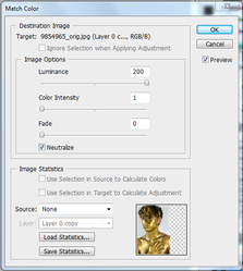
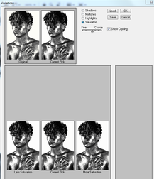
I took the photo i had previously edited and experimented with it again. I went onto match colour and began to adjust the levels of this. I turned the colour intensity and fade all the way down. Furthermore i went onto variations and began to desaturate the image until i thought it was enough. Lastly to finish the photo and still have the metallic effect in place i increased the contrast of the photo,
|
|
|
|
Final Pieces