ALTERED STATES
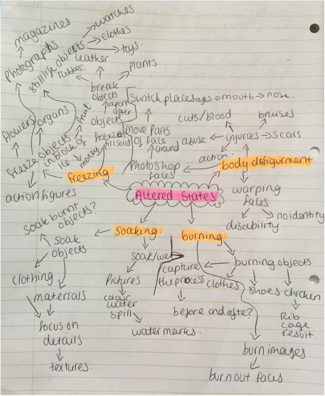
In my altertered states unit i aim to take objects and give them a new identity. For example to burn them or freeze them, this would either change its physical appearance or the meaning of the object. For this page i want to stick to non-portrait images and focus on detail as well as the message behind the photographs.
Mood-Baord

|
|

|
Ideas
|
|
Brainstorm
|
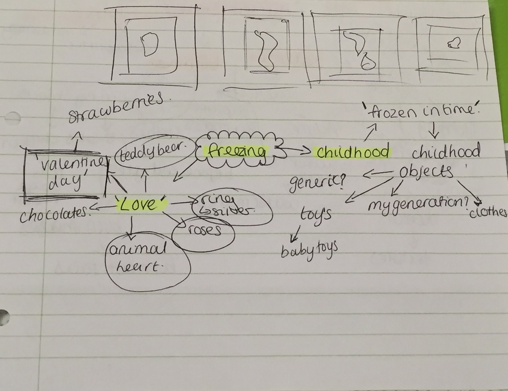
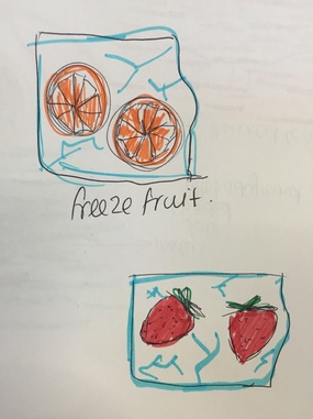
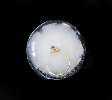
I have chosen to go with the 'Valentine/love' theme, for this i will use a one, a ring, a teddy bear and animal heart. I will be freezing these items in different sizes. The implications of freezing the items suggests a cold hearted love, or a 'bad romance'.
|
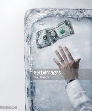
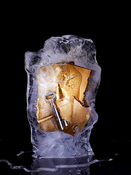
Nori Inoguchi
|
Born in Japan, Nori Inoguchi was educated in New York where he refined his passion for photography. His love of luxury and desire to create visually stunning images inspired him to become a still-life photographer; NORI seeks to find beauty in all of the objects he shoots. |
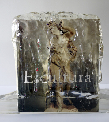
This is my favourite photograph from the collection of ice pictures Inoguchi took. in this image it looks like he has frozen an image or a magazine, i really like this due to the colours of the image. The use of greens and browns along with the shine and transparent ice, in my opinion really compliment each other and make the photograph more appealing to look at. Furthermore the disfigurement in of the women in the image due to the ice attracts more attention to the view to identify who it may be. Lastly i like this photo because of the way it was lit, the way certain parts of the ice have a shine and others don't, plus the use of the white/grey background allows the photo to be minimalistic.
|
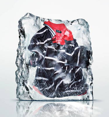
This is my second favourite image from Inoguchi's collection, i like this firstly because of the rigid ends of the ice, they have not been cut smoothly and that adds the the image. Also appreciate how the t-shirt is composed, it hasn't been attempted to be neatly laid out but it crumpled and folded in some areas. The image had a edgy atmosphere to it also as this is an everyday item and would not be thought of to froze. Moreover, the use of the white background brings nothing but main focus to the subject. Lastly i like how the ice is reflected on the floor in this photo, it is something i would like to recreate in my photoshoots/recreations.
|
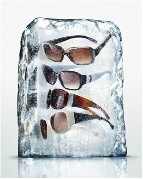
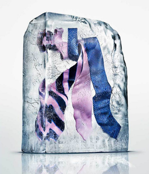
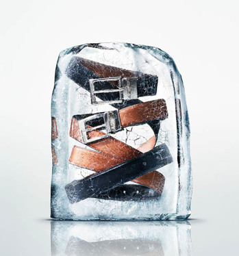
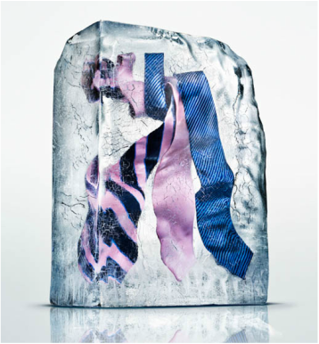
In Inoguchi's collection he captured these two photographs, these images are different to the others because he's used multiple objects within his ice encasement. I think that by doing this he has made the photographs more interesting, as one simple object would be slightly boring to look at. Furthermore he has managed to have the belts entwined and the ties are placed in the same line. I think that from doing this, 1) is is easier to identify the objects and 2) it is more visually pleasing to see something different. Additionally i really like how the texture and hints of colour of the ice have been captured, it seems that the use of the white background allowed the ice to be reflected as well as show the details of the ice.
Recreation
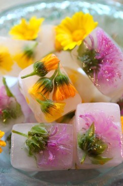
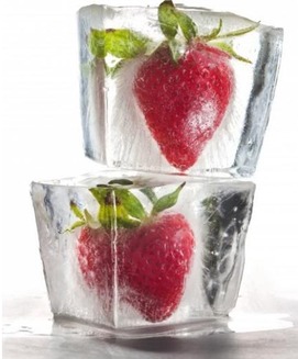
Thinh Dong
|
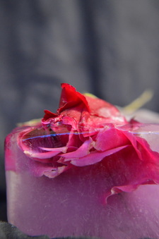
Thinh Dong is a photographer and filmmaker, who lives in Sydney, Australia. Dong created a frozen roses series called 'Violent and Still' in 2013. He created a message by using flowers to push for action against climate change. |
|
|
|
This is a photographs from Dong's collection which i like a lot. Firstly i really like this due to the way the photographer has composed the overall photo, he has allowed it to be top heavy and the rest completely bare with black background, he hasn't centred or filled the frame with the frozen flowers, i feel that this has made the image instantly more engaging. Also the use of pastel colours and a black blackground, has in my opinion created a subtle mood of a damsel situation. I greatly appreciate the way the image is taken and when taking my photo's i will experiment with a black background as well, as well as attemping to take the phoo in this exact frame and angle.
|
For this image Dong has centered his subject, the flowers in the ice are mostly not fully encased. Personally the use of that particular stem isn't appealing to me. However, he has used a black background again and this has allowed the colours on the flowers to stand out even more, the colour scheme has depicted a dark/viscous mood. Not only this but he has used thorns within this image, this has created a deadly atmosphere. Furthermore in this photo he has captured the shine on the ice in various places, this has made the photograph appear more 3D than his other images.
|
These two images are my favorite from Dong's 'Violent and Still' collection, i really like the rotation of the photos, this is because even though it's the same image it has given off the feel that they are two separate photographs. Also the overall saturation and colour of the ice in the first image is a feature which i really like. The main reason i think these two photo's stand out the most for me is because of how the flower is composed within the ice, the stem and petals are poking out of the ice. This is different to the first photographer i looked at as all of his subjects were fully encased, i have been attracted to the way Dong has composed these images, and want to recreate it in my work. Lastly the use of the black backdrop brings a dark and deathly atmosphere to the photo along with the flower being frozen.
Recreation
|
|
|
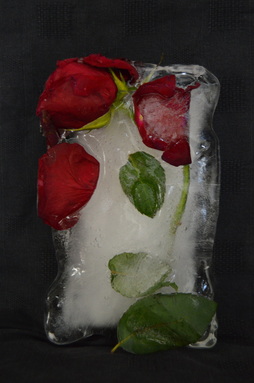
Photoshoot 1
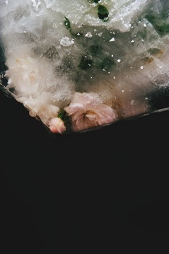
This photoshoot was done in my garden using natural lighting, the aim for this shoot was to have my first attempt at capturing the ice and encased objects in detail and from various angles. I have also taken inspiration from Dong's work when doing this photoshoot.
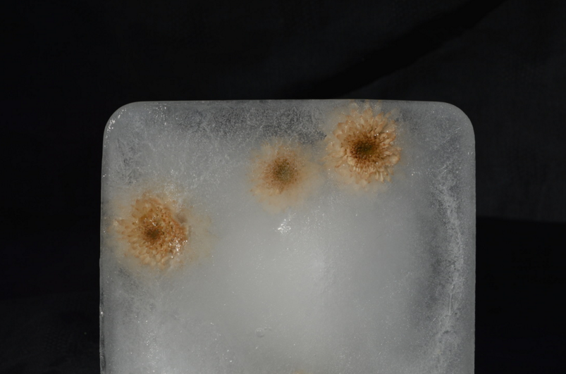
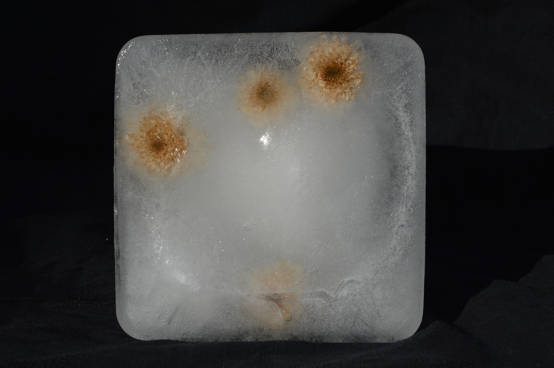
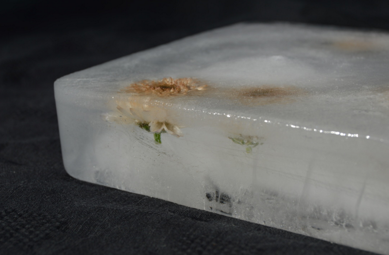
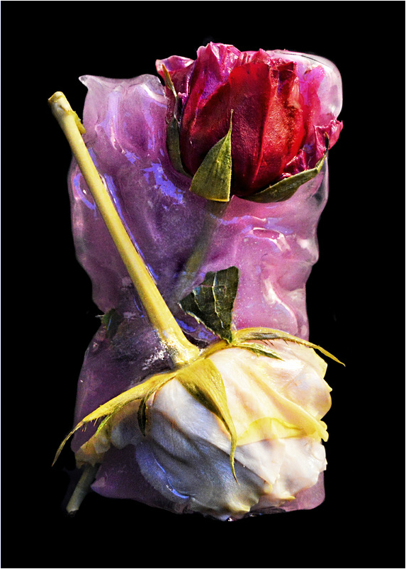
This is one of my favourite images from this shoot, i like this photo specifically because of the way i have composed it. I have centered the object but only photographed half of it. I chose to take the picture of the part of the ice which had the most flowers in it so that the photo was not boring. Furthermore i used a black background for this, this was in inspiration of Thinh Dong's work. The natural lighting in the image worked to my advantage as well as the angle i took the photo from - the background is almost completely black and the ice and flowers are clear and captured well. The flowers were originally pink but after freezing them, they became a yellow/brown, i will try and turn them back to pink in photoshop and see how it turns out.
|
I really like this image because you can see underneath the surface of the ice as well as on top of the ice's surface. I feel that this photo emits a deep mood and emotional atmosphere - i say this because when i look at this it image it seems to be telling a message, for example 'there more to what the eye meets'. Moving on, for this photo i decided to do a close up, i think i was successful in photographing the textures of the image, as you can see the ice appears frosty on top but wet on the sides. Not only that but i used a shallow depth of field on the visible frozen flower and i used the rule of thirds to make the photograph more engaging.
|
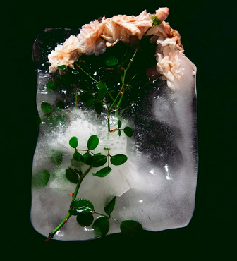
Photoshoot 2
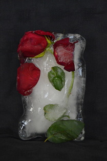
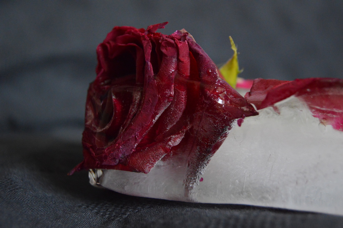
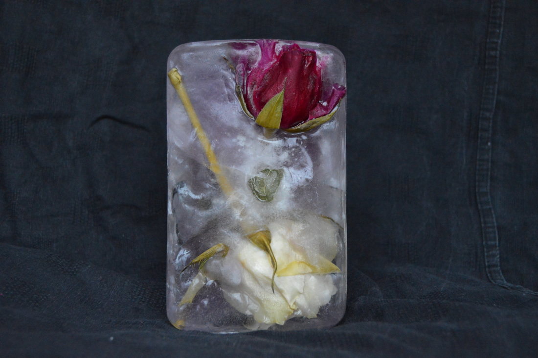
This is a photoshoot of my rose encasement in ice. This shoot was done in my house using a black background, once again like Thinh Dong's work - using a black background allows the subject to be much more prominent. I used natural lighting for this shoot, i did the shoot midday so the day light coming through was very beneficial. My aim for this shoot was
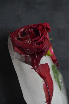
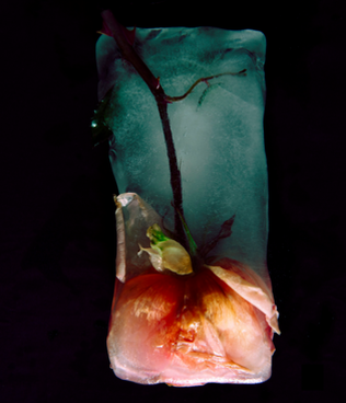
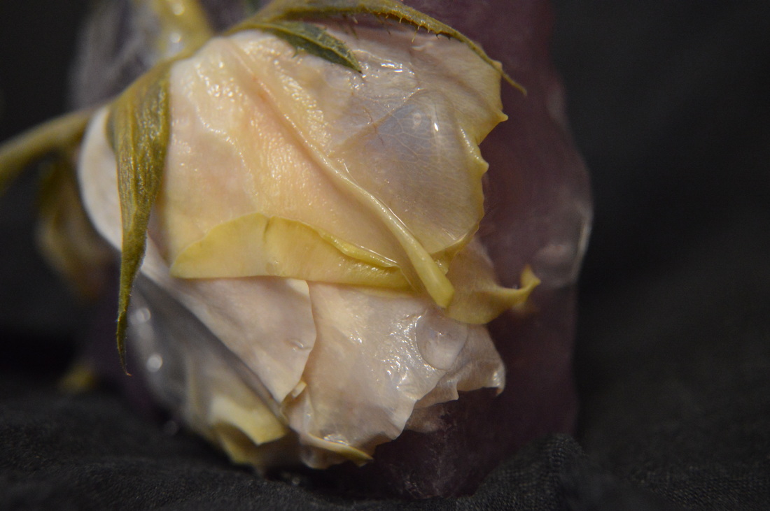
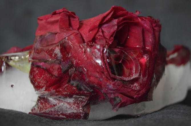
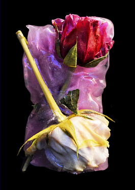
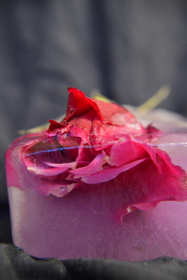
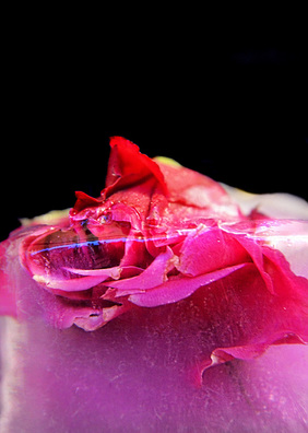
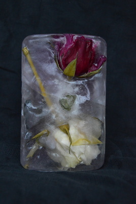
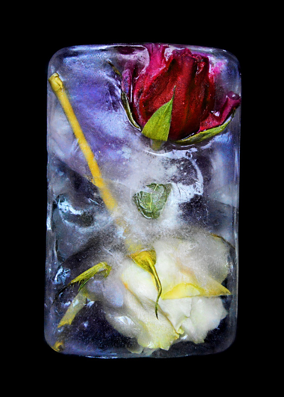
this is my favourite photo from the shoot, I took this in my house using natural daylight. this part of the shoot was when i took the the ice subject and melted it down so you could see more of the rose, and so that it looked less neat and more like Dong's photography. I feel this image was successful due to the angle i have taken the photo from. I appreciate the composition as it is taken from a side angle, i did this so you would be able to see the rose inside as well as outside the ice - the transition. Furthermore i have used a shallow depth of field, i really wanted to focus in the rose and its two different states in this photograph.
|
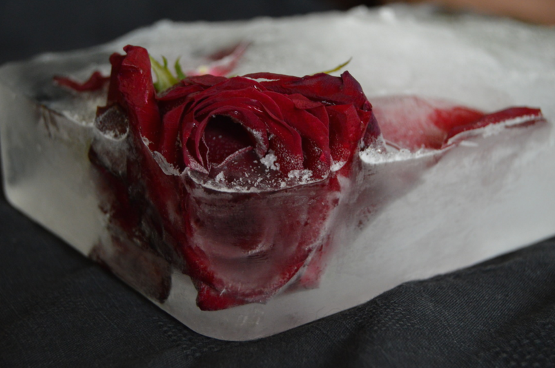
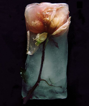
This is another photograph that i liked from the shoot. I used natural daylight through the window for this shoot. I chose this photograph because this was the state of the ice block before i melted parts of it away. I like this photography because i used a shallow depth of field and with this i captured the frost on the ice. I also aimed to capture the rose in the ice as well as out of it, this could also depict a message of love and set the mood to be a 'bad romance', like a love that has slowly died. This could definitely fit in with with the love/valentine theme idea i have. Moreover i have take the image from a slightly higher angle so that you can see the rest of the ice - so it doesn't look like a small subject - filling the frame.
|
Photoshoot 3
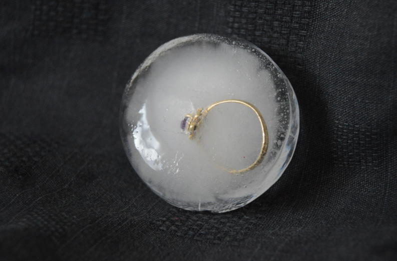
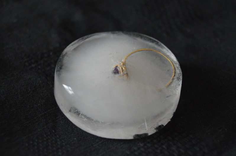
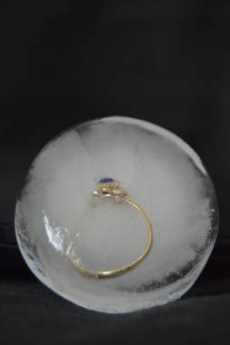
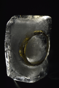
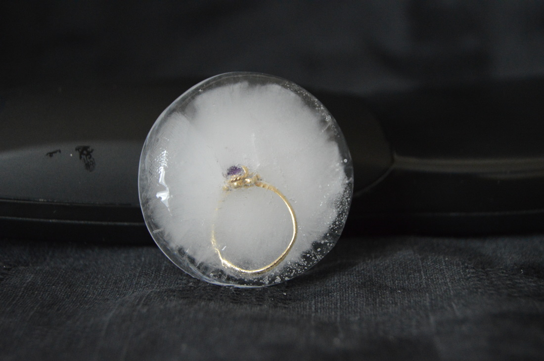
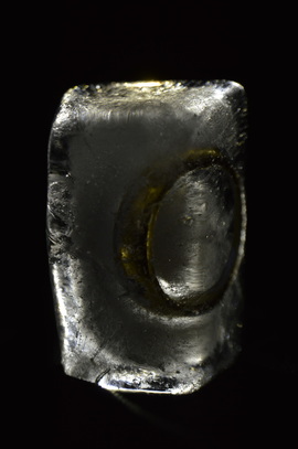
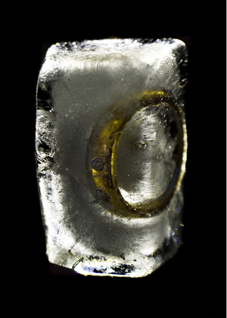
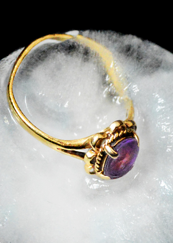
This photoshoot was done in my house, i used natural lighting from the window. In this shoot i froze a wedding ring, i made this a smaller subject. My aim for this photoshoot was to try and capture the ring in clear ice, i attempted to do this by boiling the water.
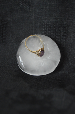
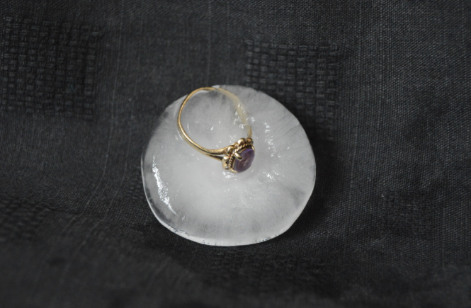
This is the photo which i like the most after i melted away some of the ice. This is different to how i melted my rose, as this time i melted much more ice, nevertheless the ring is still in the ice but majority of it is on the outside of it. I like this because you are able to see the actual ring tone itself. Furthermore, i have centered the subject as i wanted the ring to be the main focus and be straight in the middle of the image. This way there would be no distractions within the photo.
|
This is my favourite photograph from this shoot, i like this one particularly due to the angle i have taken it from, it is a close up and it's slightly a low angle. I think that the use of this angle has also allowed the bottom of the photo to be filled and the top spacious. I like this composition as i have allowed the natural lighting to highlight parts of the ice and made it look more seethrough. Furthermore i like how the object is obvious to the viewer, plus i like how the colour gold (of the ring) is a big contrast to the white/grey ice colour. This really lets the ring stand out and become the clear focus of the photo.
|
Photoshoot 4
|
|
For this shoot i used two new maginifying lenses, this was so i can take close ups of the subjects in full clarity. These lenses were very useful and i will be using them for all my images so that i can get close up, detailed shots of my ice blocks. My aim for this shoot is to capture the subject in the clear ice, to achieve this i boiled the water multiple times before freezing. |
Photoshoot 5
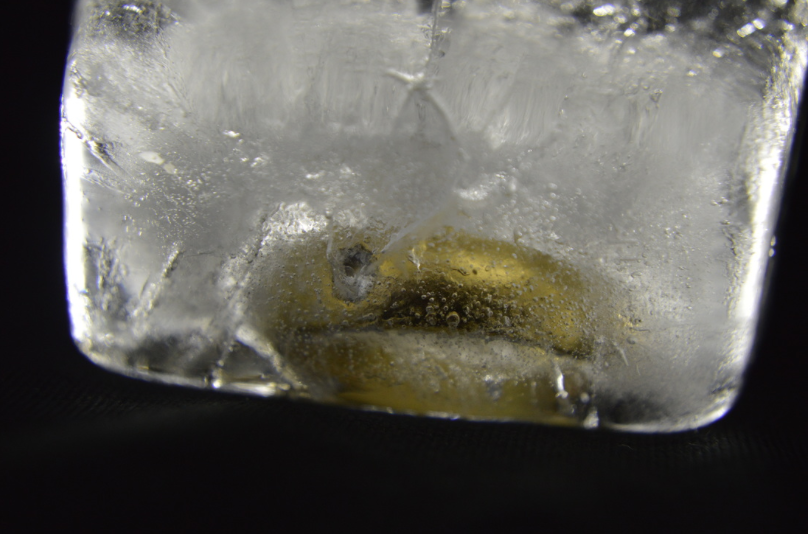
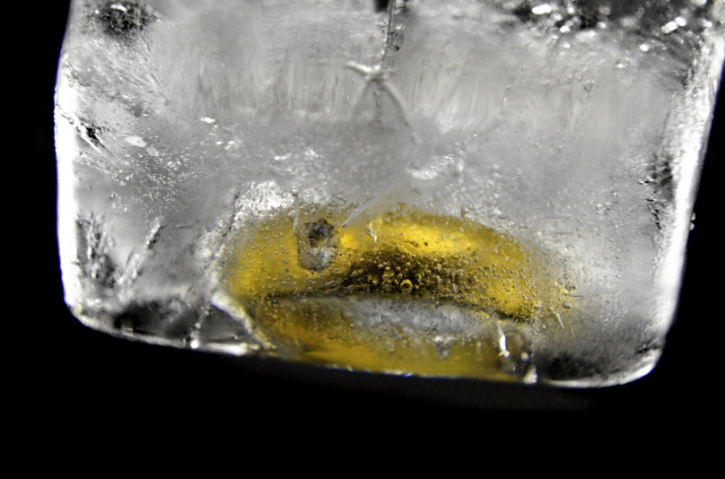
For this shoot i was using a back light against the ice block, therefore this would clearly outline the subject inside the ice block as well as the details of the ice. I used black background because i thought that the gold ring would contrast well with the light and the background.
This is one of my favourite images from this shoot, i like this one in particular because of the angle i took this from, it allowed the light from behind to reveal cracks and scratches on the ice, not only that but the ring in the ice has been outlined and the outline around it has appeared as clear ice. I think that taking these photos vertical came out a lot better then the horizontal, i noticed that the back light was more obvious this way and created more depth within the subject.
|
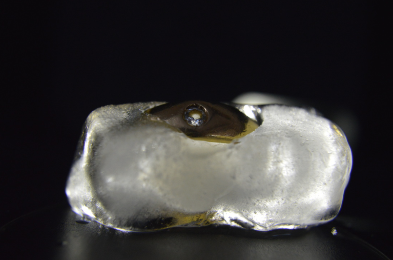
For this photograph, at this stage i had melted away some of the ice, this way the ring was much more visible and the ice had lost its rigid cube shape it had to start with. I used a black background on his as well as using a backlight to outline the ice and highlight the object's location inside the ice. i do like the way these images came out and i will be editing them, either with this photo or similar ones, i might crop the photo so that we can see the ring in more detail stuck in the ice.
|
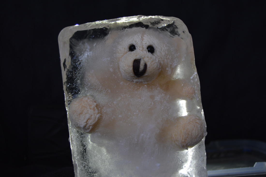
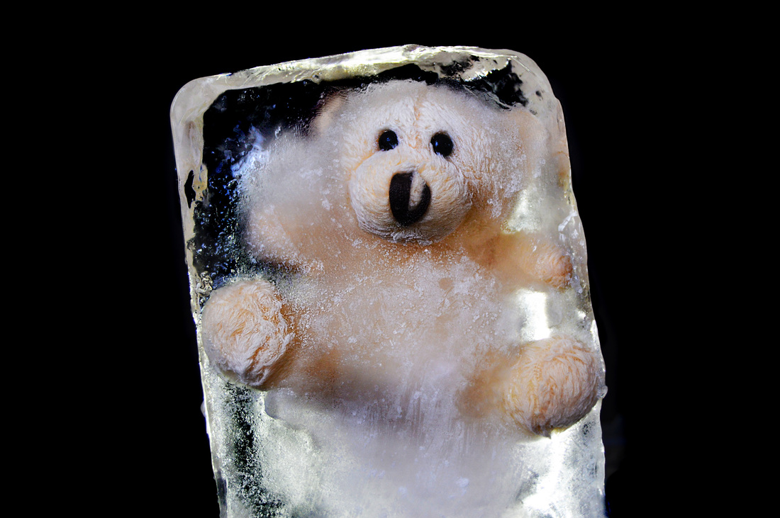
Photoshoot 6
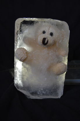
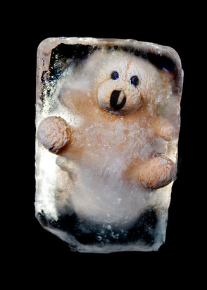
This photoshoot was using a teddy bear as the subject. For this shoot i used a white background as well as black to experiment and see if the white background would look good. The aim for this shoot was to get successful detailed images with a backlight, as well as long shot photos of the whole subject.
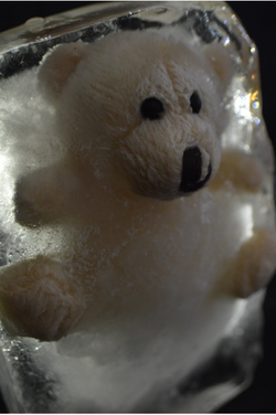
I thought this photo turned out well, in this i used an extra lens 10xmm. For this image i used a black background. I mainly like the composition of this, ive taken it from a higher angle, making the head of the bear in focus. Also i like how the bear itself appears straight up but the ice isn't straight. I also used a backlight on the ice block, the backlight has helped outline the bear, as well as this the ice has been able to appear more transparent, furthermore i like the effect the light has left on the ice at the top right of the photo. The ice appears glistening also with other colour lights in it.
|
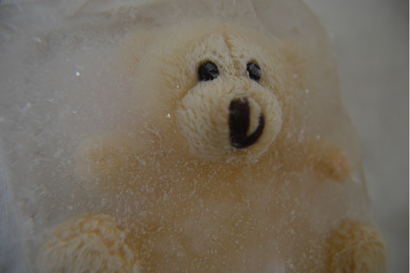
This is the second photo which i quite liked from this photoshoot. This photo was taken on a white background. I like this image because i took it at the start of the shoot when i took the ice block out of the freezer, so you can still see the frost on the surface. Furthermore i feel that the ice has blending into the background and i think this has given the effect that i have filed the frame with the close up i have taken. Plus i like that i haven't frozen the bear completely and allowed the feet and face to stick out, i think this just looks better than the whole subject encased in ice. Lastly i have used natural light in this photo.
|
Photoshoot 7
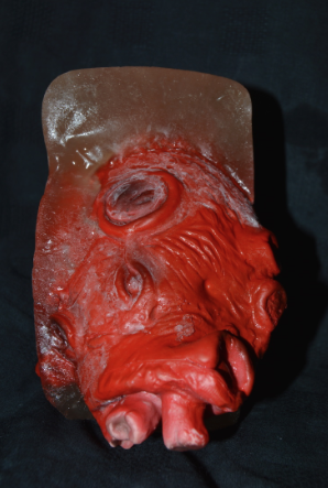
For this photoshoot i froze a heart as another symbolic item of love. When i froze the heart i created a blood looking liquid and covered the heart in it. I then placed it into the container of boiling water and the fake blood began to colour the water. I think that the result of this was good, it may not be pretty to look at but it does represent the cold theme i am going for.
Personally i got some good shots from this photoshoot but i didn't really this shoot, i feel that the syrup that i made created a dirty colour in the ice. Furthermore i think that the heart appears to plastic and the textures are obvious, whereas all my other images contain subjects which are real. I will edit one of these for experimentation purposes and see how it comes out. I also think i should of incased the heart in a smaller ice block.
Photoshoot 8
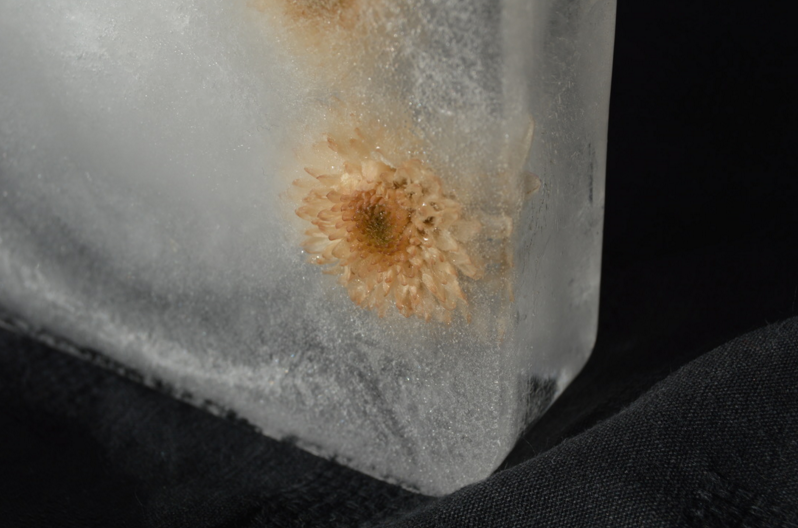
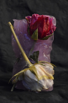
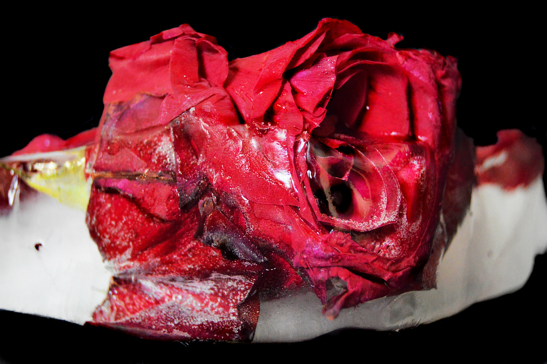
This photoshoot was in purpose to redo my rose shoot, this time i decided to use 2 roses and of different colours, i found that this was really successful when frozen as the colours ran from the flowers and created a rally nice purple tone to the ice. Furthermore my aim for this shoot was it capture the ice in its normal state and then when i melted some of the ice way. I also used a different sense which allowed me to take close up detailed images, which was another one of my aims for the shoot. As for lighting i used natural lighting, a backlight and standard lamp lighting.
This is by far my favourite close up of the rose. I like this one particularly because of the colour of the ice which the rose has caused, the ice near the petal has a pink/purple colour to it and i think it further expresses the theme of love. I used a 10xmm lens for this and i think the clarity of the photo is whats most important as you are able to see the texture of the ice and the difference between having the rose being frozen and half of it not frozen. i also framed the photo so that its bottom heavy, and even though I've left the top empty the flower is still the centre of attention.
|
This is my favourite photo of the ice block in its original state. typically this image would of been taken vertical, however i decided to do it landscape and i found this way that more light was let in, i like this as the image is clear and you can see the shin on the ice which is what i was going for. Secondly i like the undertone of purple that you can see in the ice in this photo, it goes really well with the flowers and the theme of love of course, the colour of the flowers ran and created this colour. When using this image in photoshop i will cop it to be vertical so it still keeps the qualities it original has but the frame can be the same as my other final pieces.
|
Photoshoot 9
The aim for this photoshoot was to capture the ice in melted state and also use a backlight toes what effect that would create. Im definitely hoping to have a final piece come out of this shoot. I also used natural lighting and standard lamp lighting with black backdrop.
this is my favourite image of the ice block after i had malted away some of the ice, i melted the ice as this was an ice i had to make the subject look more appealing and vary from the original state it began in. You can tell that after melting away the surface of the ice the purple undertone in the ice has become more prominent, i really like this as all the colours of the subject work well together. Furthermore to light this i have used a standard limp as well as natural lighting coming from behind the camera.
|
In this image i captured the white rose after i melted away the ice, as you can see the petals are wet and i think that this close up is one of my favourites. I used the 10xmm lens for this and think it came out really good. I think this photograph create a bitter sweet mood, as love is the theme the fact the flower is wet and weak implies that love is possibly dying. As when its frozen it represents a cold hearted type of love. However, you can't really see the ice in this photo, it is there but in the background as the actual rose isn't frozen anymore, so i won't edit this photograph as it wont fit in with the rest of my final pieces.
|
Experimentation
|
Before:
|
After:
|
|
|
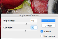
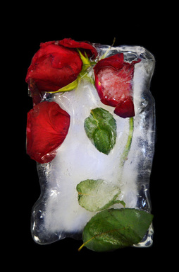
This was my first experimentation for this page, i decided to stick the basic editing skills for this, i found that it was a successful outcome. I Firstly changed the brightness and contest on the photo, i made the brightness high because i wanted the shine and wetness to be clearly seen. Secondly i used the burn tool in 'shadow', i used this on the whole background so the it was completely black. Furthermore i used the dodge tool on the highlighted parts of the subject to exaggerated this. Lastly i added new layer and used a deep blue paint over some of the ice to add a tint to it, i overplayed it with color and on 83%, i then used the eraser on a low opacity and downed this down.
|
|
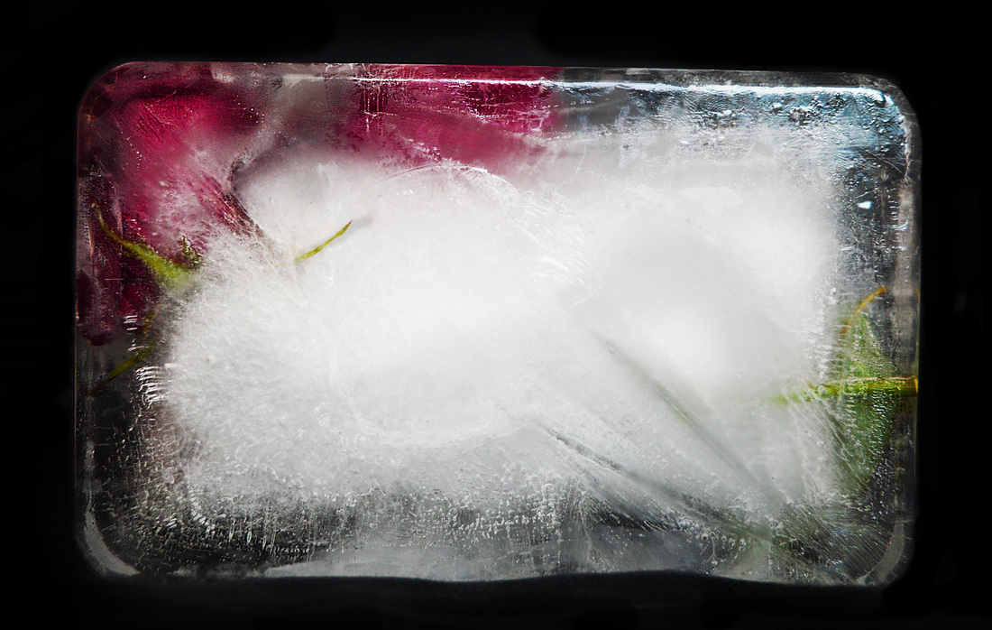
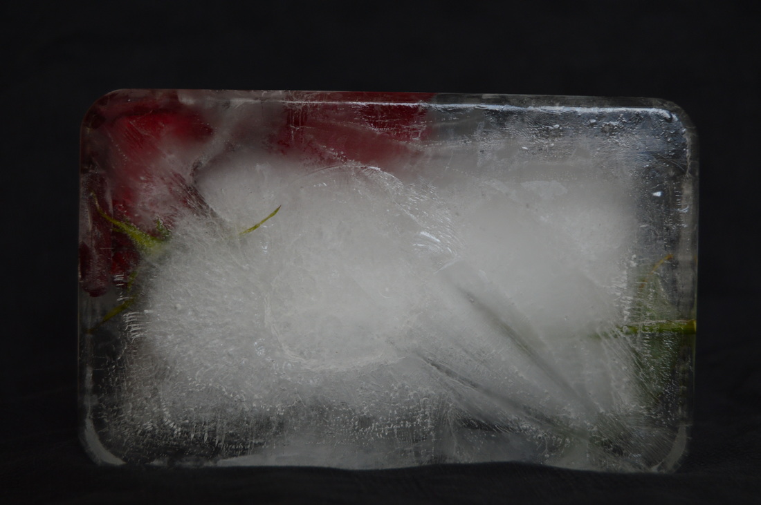
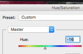
this experimentation is different to my original idea, this is the back of the ice block, the first thing i did was adjust the brightness and contrast. i then took the burn tool and blacked out the background. After this i changed the hue/saturation to -16. I really liked the colour of the hot pink instead of the red on the rose. I then took the sponge tool and went over the blue tint on the ice, as well as over the rose and stem. Lastly i used the sharpen tool and went over the whole of the subject to enhance the details on in this image.
|
|
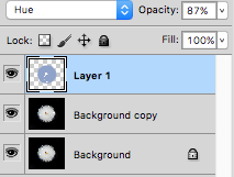
I think this was a successful outcome, i began by adjusting the brightness/contrast of the photo. I then used the burn tool to ease the whole of the background and let the ice stand out. I used the dodge tool to enhance the wet shine of the ice and make it appear more 3D. i then used the sponge tool to increase the tint of blue around the corners and on the ring to make it prominent. I created a new layer and painted over the whole ice block with lilac and overlaid this with 'hue' then turned the opacity down to 87%. Lastly i used he sharpen tool all over the subject and mainly on the ring.
|
|
This is an experimentation for my ring shoot. I like this turn out, it was a very simple edit, i used the burn tool in shadows on the background and on the ice to make the ice appear more clear. Furthermore i used the sponge tool to enhance the colour of gold - this lost looks like a black and white splash colour photograph. Lastly i used the sharpen tool all over the photo mainly focusing on the ring.
|
|
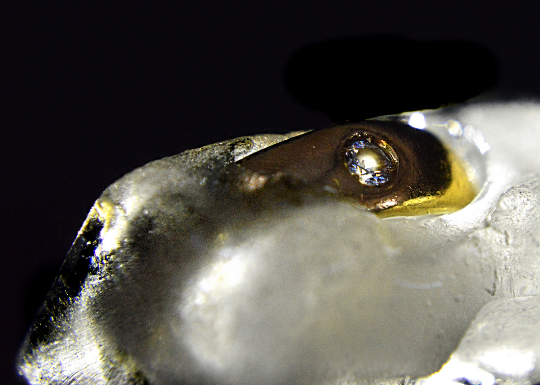
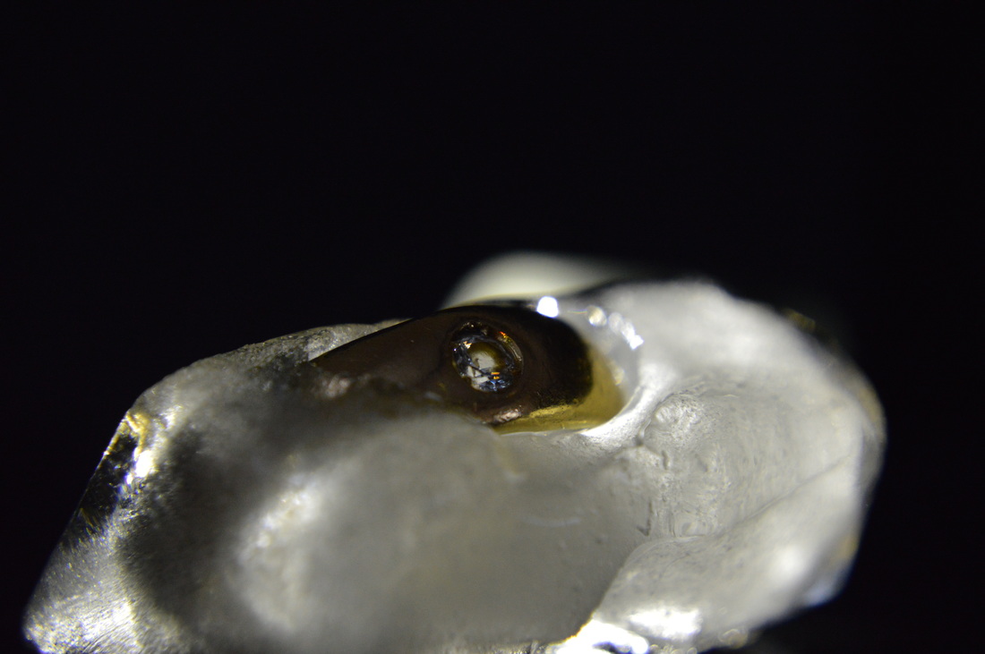
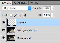
I really like the way this edit turned out. I used a backlight oaths photo so it has now appeared with more of a darker contrast. Firstly i adjusted the brightness and contrast, then i took the burn tool and erased the background out to make it pitch black. I used the burn tool again on certain parts of the ice, i did this so that the ice looked more clear. I then created another layer and used white paint in he centre on the diamond and overlaid this with hard light at 46% opacity. The next thing i did was duplicate the background layer and use the clone tool to clone the blue diamond reflection in the diamond onto to other parts of the diamond - this was to give a more starstruck impression of the ring itself. Also i used the sponge tool and used this on any areas where the ring can be seen and then used the sharpen tool all over the subject of the image. Lastly i cropped the photo and used the rule of thirds to make it more interesting and appealing to look at.
|
|
I really like the way this photo came out, it wasn't a complicated edit but i had to take in every detail as this was a close up of the rose in ice. Firstly i adjusted the brightness/contrast, i then took the burn tool and made the background completely black. I also used the burn tool on certain parts of the petals, where there are shadows from there petals. Furthermore i used the ogre tool over the ice and where the elections are visible, i id this so its obvious to see where the ice is, as it smelled in the image and i want this to be clear. The second to last thing that i did was use the sponge tool all over the rose, i did this twice to enhance the colour. Lastly i used the sharpen tool al over the photo and also in the centre where the details of the rose appear.
|

|
|
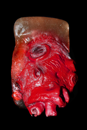
This experimentation i found a little bit difficult in the sense that wasn't automatically pleased with what i had produced, i feel that the heart appeared to plastic and fake, and this was probably due to the flash even though the images turned out better with flat than without. the first thing i did was turn the contrast up a lot and the brightness a tad. I used my camera flash then taking these images of the frozen heart as it came out clearer and more of the colour was detected this way. I realised didn't really like how strong the colour red was in this, it also increased the plastic texture/look on the heart. To reduce this and make it look better i changed the hue of the photograph to -12, this gave it a pink undertone. I used the burn tool to make the background pitch black, i also used the dodge tool on the ice and frosty areas. Lastly i applied the sponge tool all over the image as well s the sharpen tool.
|


|

|
the first thing i did for this photograph was use the burn tool and erase the background, the next thing i did was decide to crop the image and make it a close up, i just thought this would be a different angle or perspective of the image, which is unlike all my other photos. I then used the burn tool to deepen dents in the ice as well as the shadowed areas in the ring. Next i used the sponge tool on the ring and diamond. I wanted the diamond to stand out more so i added another layer and then used a lilac/deep purple colour around the centre of the diamond and applied the overlay soft light and turned the opacity down. I felt that the ice was too white and plain so i created another layer and with paint and soft light overlay i included a hint of baby blue if the ice mainly at the edge of the image where the shine of the ice is - helped increase the shine.
|
|
This is one of my favourite outcomes from all the shoots on this page. I really like the way the end result of this edit. I began to august brightness/contrast first. Next i used the burn tools in 'shadow' to erase the background, i used the tool over the ice on parts where they were slightly transparent to make it look even more clear. I also used the burn tool on parts of the teddy which are outside of the ice to create a 3D look. I used the sponge tool on parts of the ice that reflected blue light, i found that some parts could use more of this blue tint so i took the clone tool and applied this on real of the ice. Lastly i sharpen the whole subject of the photo and focused on the visible parts of the bear.
|


|
|
When i chose to edit this i aimed for this to be one of my final pieces, i been editing the brightness/contrast first and then used the burn tool like usual to create a black background. Using the burn tool again i applied this to parts of the ice where i could make it appear more transparent, furthermore i burnt areas of the bear that are showing so that it could appear more 3D. I used the sponge tool on the bear to add some colour/warmth to the image. Forever i felt that the colour of the ice looked dull so i changed the hue of the photo to -25 and this gave it a warm tone on the ice which was a similar colour to the bear itself. i used the eraser to remove this colour of the bear though, and kept that as its original colour. I felt that the eyes of the bear needed colour so i created another layer and applied blue paint to it in the overlay hard light. Then i used the sharpen tool all over the subject a lot, i wanted the textures to look fine and for people to be able to actually see the details of the ice and bear. Lastly i cropped the photograph so that it was framed properly.
|
|
|
I aimed to edit this photograph for my final piece, i firstly turned the brightness up and then using the burn tool made the background pitch black. Using the burn tool again i went over parts of the ice which looked see-through, this enhanced the effect of it looking transparent. I then turned the saturation up to allow the ring to stand out. Before adding another layer i used the sponge tool on desaturate on went over some of the ice that appeared yellow. With a new layer that i added i took a deep blue and with a tiny brush i applied small booked dots to some areas on the ice, i did this to create a sense of reflection on the ice from the light - i overlaid this with soft light. The next thing i did was import a similar image to this from the same shoot on top. I did this so i could photoshop in a diamond onto the ring as originally it wasn't clear toes. I erased the hole image leaving the single diamond, turned the opacity down slightly and used the eraser on a very low capacity over it, to make sure it blending in with the photo. To make sure it was fully blended in and looked like it was in ice, i tooth clone tool and took a part of the ice and placed it over the diamond. I think used the eraser again and gently went over the clone stamp to make it look blended and natural. I then created another layer and overlaid in soft light a subtle blue in the diamond for it to pop. And the last thing i did was use sharpen the while image.
|

|
|
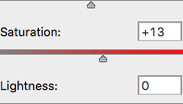
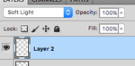
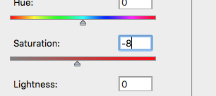
Im really pleased with this outcome and ill be using it as one of my final pieces, i began with the brightness and contrast, i then took the burn tool in 'shadow' and erased the background, using the same tool i went in to the dents and darker parts of the ice so that the contest was more defined and that the flowers stood out - this also gives a 3D effect. I then used the dodge tool in 'highlights' and went over all the wet parts of the ices surface and i used this on the white rose to make it look more alive. I used the sponge tool to go over the whole subject to create more vibrancy. I then sharpen the whole image but on a opacity of 40%. Lastly i thought the image was too saturated in places so i turned this down by -8.
|

|
|
For this i began by editing the brightness ad contrast on the photo, i then used the burn tool and made the backdrop completely black, i used the burn tool again on the rose, where the petals meet, and wherever there was any darkness to create a clear contrast between the highlighted areas. I then used the dodge tool on the ice where it appeared wet to give it extra shine and make it clear where the ice was. I then moves on the use the sponge tool all over the photo and enhance the colour of the rose and the pink ice. I then cropped the photo so the flower was more close up and filling the frame almost. Next i created another layer, the bottom of the image was showing a bit of the background to i just used the clone tool replicate the texture above to below so that the background want showing anymore. Lastly i sharpens the whole image on a opacity of 60%.
|
|


|
My aim for this photograph is to create a final piece out of it, which i think i successfully did. Firstly i used the burn tool in shadow to make the background black, i then used the burn tool on the ice to make certain parts appear more see-through, next i used the same tool on the flowers to create contrast and a more 3D look. I used the dodge tool in highlight after and applied this to the wet areas on the ice and flowers, this was to make sure that the ice was obvious on the flowers and to create that 3D contrast with the brunt tool. Next i used the sponge tool to enhance the colours on the subject of the image, after this i decided to duplicate the layer and change the hue so that the rose looked more red than pink. With the eraser i erased the hue on the whole of the photo apart from the rose and small parts on the white rose. Lastly i used the sharpen tool all over the photo, i used the tool a bit too much so i went over the parts i felt were to sharp/grainy with the blur tool a applied this a bit.
|
Final Pieces

|
|


|

|
