FACE PAINT
This page will be focusing the various ways of how paint can be creatively used on the face. For this unit i will be working on textures of the paint or how the textures may appear on the face, also the paint may not be vibrant or in colour. I will be attempting to perfect 1 or 2 ideas for my final outcomes.
Mood-board
|
|
|
Ideas
|
|
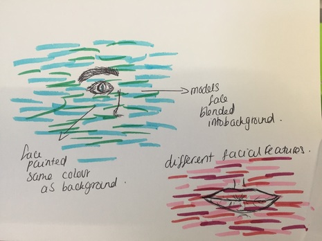
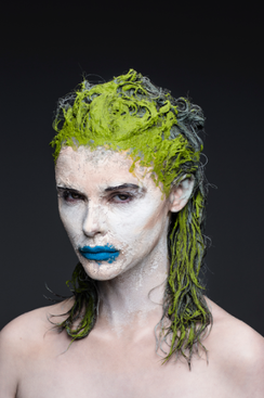
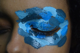
one of my main ideas for this unit is to attempt to create a morphed image. For example the first drawing here would show how would paint the whole of someone's face in various colour pallets as well as paint an A3 paper with the same colours and then take the images of the model and the background separate and then photoshop them as one, leaving certain features visible.
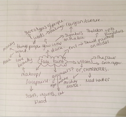
Brainstorm
Pauline Darley
|
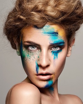
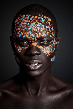
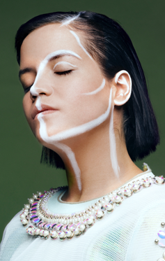
Pauline Darely is a photographer from Paris, she photographs for major companies such as Sony, Universal, Fox, Comptoir des Cotonniers. One of her works is a 'story' called 'she waited too long' which features a model painted as a skeleton, and another called 'house of clay'. |
I like this photograph from Darley's story collections. The lighting in this image is subtle and successfully gives her face definition and an outline. Not only this but the paint on her face is very simply however it gives a big impact. Furthermore Darley has made the model very pale, this is so that the yellow around her eyes stand out a lot more. Also the model is bare on her shoulders, this has allowed the face to attract even more attention as nothing is a distraction from it. Lastly she has used a mud green background here, this colour compliments the orange/red in her hair as well as her skin tone.
|
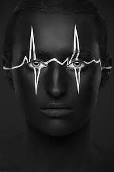
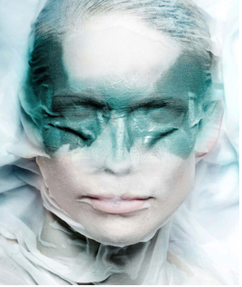
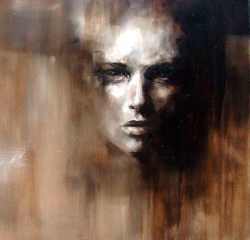
This is my favourite photograph from her various collections of stories Darley has created. I like this lot because of the colour palette she uses, the colours are grey, black and white, plus she has used a grey background, she hasn't created any colour contrast in this image, this therefore has set a very glum yet powerful mood and atmosphere. I definitely want to recreate these in my own style for possible final outcomes. The face paint i feel is very successful and portrays a dark mood and intense atmosphere. The image is composed with a mid-shot so that the waist up is only captured.
|
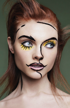
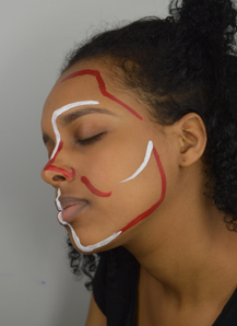
These 2 images are also apart of the stories which Pauline Darley created. The first image is very simple but i like the choice of clothing the photographer has chosen for the model to wear. I think that it works well with the white face paint which is outlining her face. Furthermore i think the outline allows the face to appear with more definition and structure. The second photo is one which has been built up on with face paint. I like the way the image is composed, it is bottom heavy and the top is just black, encourages the colours to stand out.
Recreations
|
|
|
|
Ryan Hewett
|
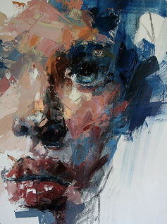
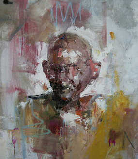
Ryan Hewett, South African born Artist based in Cape Town. Internationally the artist has participated in group shows in Berlin, London and San Francisco and his paintings have been presented at various art fairs. His portraits are not life-like depictions, but rather abstracted representations of his subjects - the depiction of leading figures from the past. |

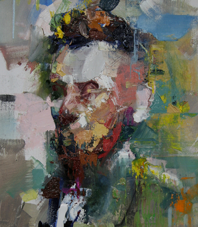
This is my favourite image from Hewett's work. I like it because of the colour pallet which has been used - the use of blues and whites. Furthermore he has made it look very 3D and realistic on certain features, i.e. eyes and lips. When using his work in my photographs, i will attempt to use these similar colours within my work and in the recreations. Furthermore Hewett has used a white background, this way the model is the main focus. Additionally he has filled most of the frame with the subject in this, automatically the photograph is appealing to the view due to this.
|
This is my second favourite photograph from Hewett's work, with this image he has blended the model into the background. This photograph has been made to look like the model is warped into the background. I like this idea and will definitely be attempting to recreate this for final pieces. Additionally the Artist has created the photograph to be top heavy, so he hasn't filled the frame, with the facial expression of the model this creates a very intense atmosphere.
|
|
|
These two photographs are of two political figures, the artist has painted them in a distorted manner. I like the way he has managed to paint the two men but not include much facial features and the viewer is still able to identify who they are. He has used a random selection of colours for these paintings, this isn't something i would want to incorporate in my photographs, simply because it would make it hard to blend the model in with the background. Lastly he has centered both men in these images and made them the main focus, also with the first image Hewett has allowed the outline of Gandhi to be very prominent unlike Lincoln's.
Recreation
|
|

|
Photoshoot 1
|
|
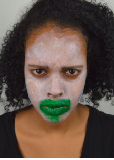
This photoshoot was a recreation shoot from the photographer Pauline Darley. I chose 2 different face paint styles for this. I did this in the green room using the white backdrop. My aim for this photoshoot was to capture the certain angles and lighting which the photographs used in her work. For the images with the white/green paint my aim was to catch the mood of the photographs. |
Photoshoot 2
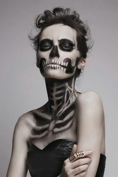
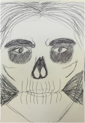
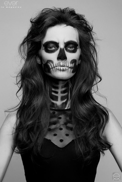
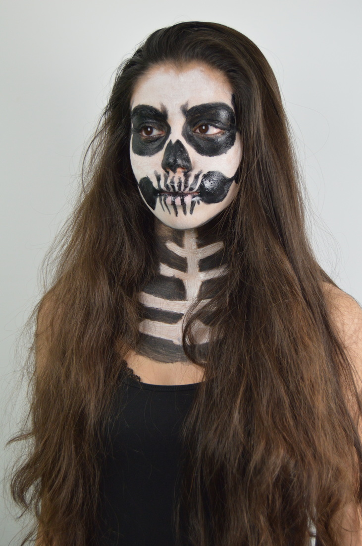
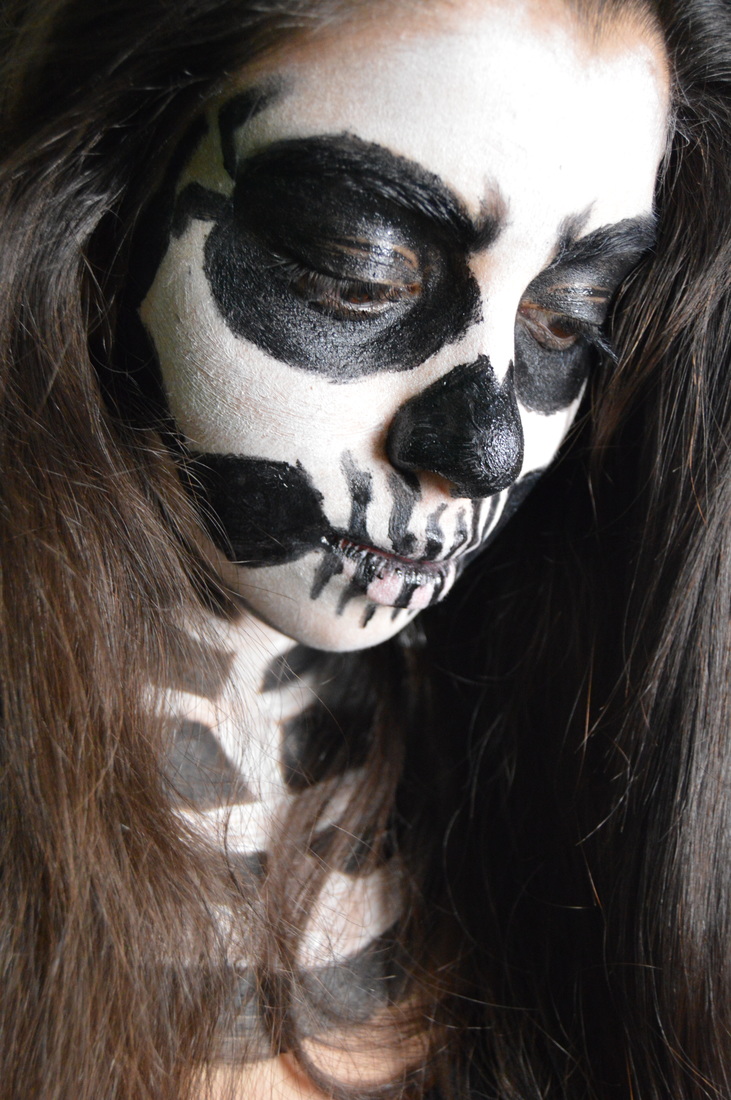
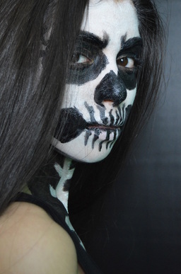
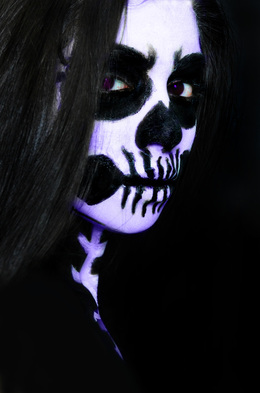
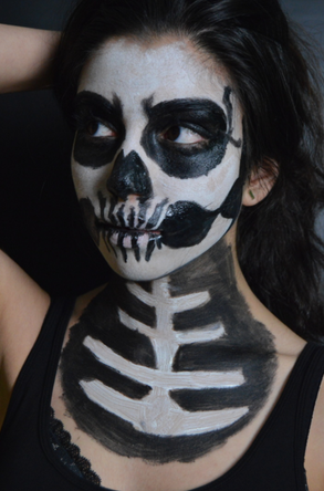
This photoshoot was done in the green room, the aim of this shoot was to successfully capture the skull facepaint on the model in a sinister way, also to explore the various angles i can take the photos from to make them more eye catching. I used both white and black backgrounds to see which one would look better.
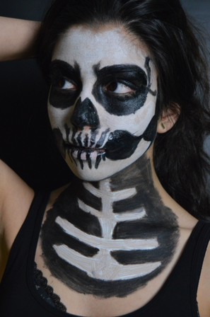
This is one of my favourite photo's from this shoot, particularly because of the lighting and composition of the photo. I have created the lighting so that the left side appears more dark and has more shadow, also this way the right side of the model is clear and the makeup is visible. I feel that her face has been nicely lit to depict a intense and thriller atmosphere. Furthermore I've taken this as a close up and filled the frame so that the focus it completely on the model and the skull. I will be using this photo in my experimentations.
|
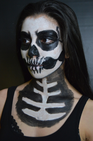
This is another photograph which i really like, i mainly like this photo for the way the hair looks and the composition of the image. The hair on the model has been pushed back and is straight, i think that this has added to the mood of the model appearing as a corps/skeleton. Furthermore this allowed the facepaint to be seen clearly. Secondly i asked the model to look to the left, and once again this way the left of her face is dark and right is clear for the viewer. Also i have centered the model and taken a close up again, i think the use of filling the frame makes the image a lot more powerful and chilling.
|
Photoshoot 3
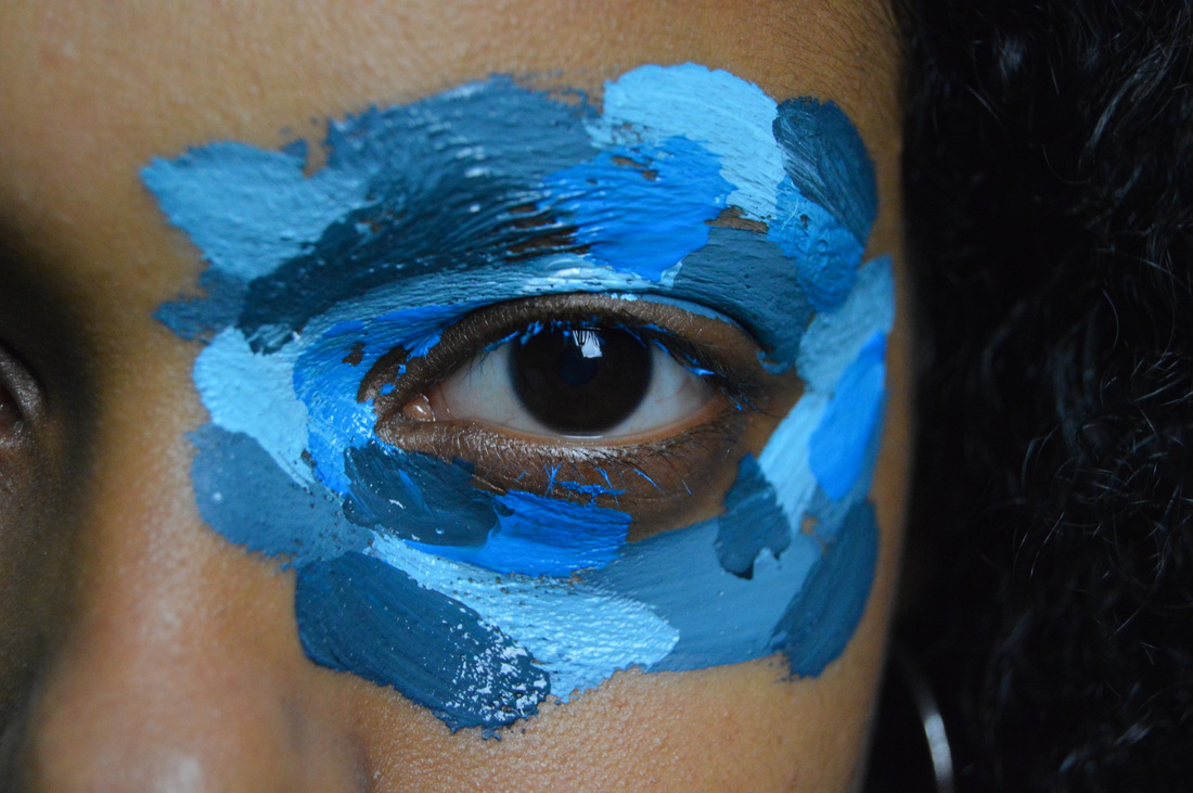
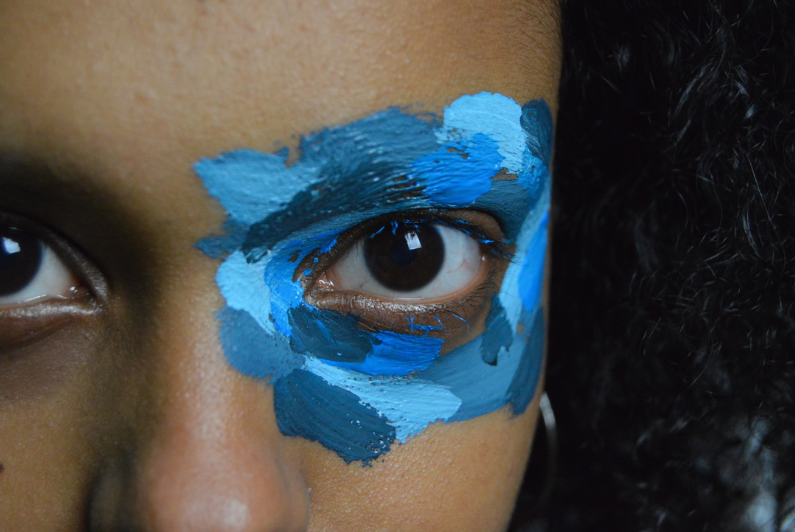
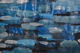
This shoot was done in the green room and against a white background, the aim of this shoot was to capture three different shades of one colour on the eye and around it, as well as doing the same thing but on paper. I will use the image of the paper to overlay on the eye image and therefore have an outcome of just the eye showing, looking like it's emerging from the paint.
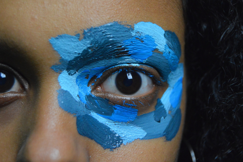
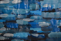
This is one of my strongest photographs from this shoot, i like this image in particular due to how i told the model to open her eye wide. I think that when editing this the image will stand out because of this. Also i used three tones of blue and i think they all blended really well so this will make it easier for me to photoshop the images. Lastly ives used a narrow depth of field, so the eye and some parts around it are in main focus, which is essential.
|
This was my second favourite photo from this photoshoot, i like this one because of the mood/atmosphere it gives off. I asked the model to look slightly up at the camera and this created an intense vibe to the photo. Furthermore, some of the paint og tonto the model's eyelashes, this wasn't intentional but i do think it added to the photo and the eye/pupil itself doesnt appear too bland or boring now.
|
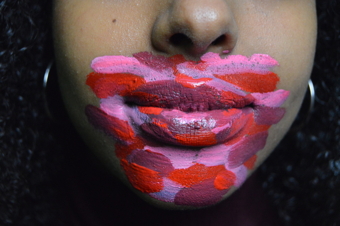
Photoshoot 4
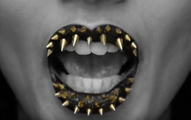
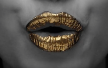
This shoot was done in the green room and against a white background, the aim of this shoot was to capture three different shades of one colour on the lips/mouth and around it, as well as doing the same thing but on paper. I will use the image of the paper to overlay on the eye image and therefore have an outcome of just the lips showing, looking like it's emerging from the paint.
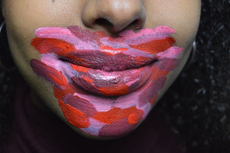
I chose this as one of my strongest/favourite photos because of the clarity, i think that that paint and lips are visually very clear and sharp. So this would then be beneficial when editing, and the image will be clear and obvious. Also i like the light is creating some reflection on the lips because then this will be of a similar texture to the image on the right which i spoke about - allow blending on photoshop to work easily and look realistic.
|
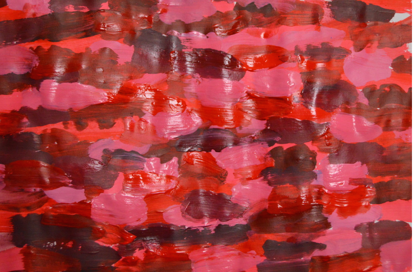
This is one of the stronger paint paper photos, i took this in the green room against white so there was no desaturation on the lighting or colours. I simply like this one because of the colours, the shades work well together and as they will be going onto the lips it expresses the mood of love or romance.
|
Experimentatoin
|
Before:
|
After:
|
|
|
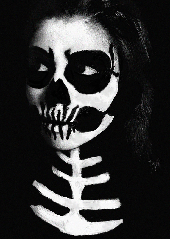
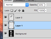
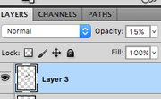
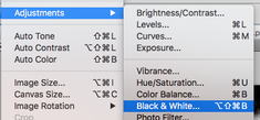
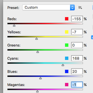
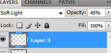
Firstly i used the burn tool to erase the background, and to go into the black paint on the face, i also used this on the bottom of the hair to blend it in with the background. Secondly, i created another layer and then used white paint over the white face paint to make the paint appear cleaner and remove some mistakes, i used the on a opacity of 50%. After this i used the dodge tool to highlight areas of the face which need to be prominent. I also added another layer and used black paint sound the eyes and turned this opacity to 15%. I realised that i wanted to create a grainy effect, so i firstly turned the image black and white. Then i changed some of the levels of this, furthermore i used a grain filter on 30%. I also used a different paint brush with black on a very low opacity, i applied this to some of the white parts on the face.
|
|
|
|
|
|
|
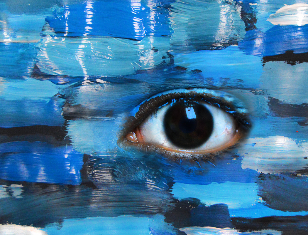
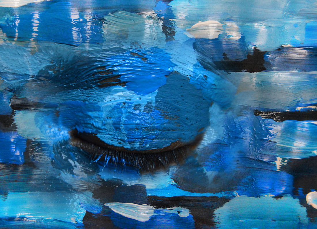
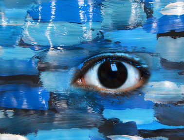
First thing i did is overlayed the A4 paper image over the eye, i then turned the opacity of this layer down and began to erase parts of it away to make the eye visible, i did this on a low opacity so that there wouldn't be any harsh lines. Next used the burn tool and applied this over darker shades and creases around the eye, this was just to let the eyelid and eyebrow to look real and not too fake/ameture. also using the burn tool on the eyelashes to make them stand out. I used the sponge tool to enhance the colour in the photo, and the dodge tool on 'highlight' to go over the wet paint,just to add texture to the photo. With a duplicated layer that i created of the A4 paper image i used the clone tool to fill in some gaps near the face with paint. Lastly i sharpened the whole image.
|
|
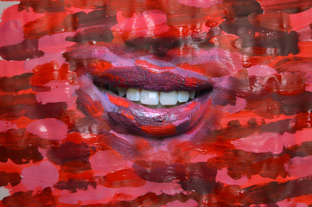
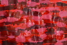
i'm really pleased with this outcome and will make in one of my final outcomes on this page. the first thing i did for this image was overlay the A4 paper image over the eye and turn down the opacity of it so i could see the eye behind the photo and begin erasing the overlaid image to make the eye visible. The next thing i did was use the burn tool around the eyeball to darken the lashes and on the darker shades of blue on the image to create contrast, to enhance this contrast using the dodge tool i used this over the wet areas of the image to produce highlight, i used this on the eyeball as well to make it look more interesting. To further the interest of the eye itself, i created a new layer and with green and orange paint i applied this on the eye to give it some colour, this wasn't appearing very realistic so i turned the opacity down, i overlayed the paint with softlight. Also with another layer i took white paint and used this on the white areas on the eye and on the reflection that's on the pupil. and lastly with a duplicated a layer i used the clone tool to make some paint be next the eye, so there's no gaps, moreover all over the image i used the sponge and sharpen tool.
|
|
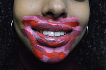
First thing i did is overlayed the A4 paper image over the lips, i then turned the opacity of this layer down and began to erase parts of it away to make the mouth visible, i did this on a low opacity so that there wouldn't be any harsh lines, moreover all over the image i used the sponge and sharpen tool. Using the spot healing tool i applied this on her teeth as there were some paint prints on them, this also gave the image a clean polished look. I then duplicated the mouth image layer so that i could clone some redder tones closer to the mouth, i was hoping this would blend the two images together, however i was finding that the fact they're two separate images was becoming very obvious. For some reason the shades of red/pink weren't blending together, so i will attempt another edit, revealing less of the original photo this time.
Final Pieces